You’ve spent money on ads, your phone should be ringing, but bookings are flat. Visitors land on your site, click around, and leave without contacting you. The problem is often not your pricing or your reputation. It’s your service menu page. When potential clients can’t quickly figure out what you offer, how much it costs, or how to book, they move on. This article breaks down exactly what a service menu page is, what it needs to contain, where most businesses go wrong, and how to fix yours so it actually converts visitors into paying clients.
Table of Contents
- What is a service menu page?
- What to include in an effective service menu page
- Common pitfalls: Why service menu pages fail
- How to optimize your service menu page for maximum results
- What most businesses overlook about service menu pages
- Ready to elevate your service menu page?
- Frequently asked questions
Key Takeaways
| Point | Details |
|---|---|
| Define service menu pages | Service menu pages organize offerings clearly to boost web conversions for service businesses. |
| Focus on clarity | Simple categories, descriptive names, and transparent pricing help users choose faster. |
| Avoid overload | Too many similar services create confusion and abandoned bookings. |
| Continuous improvement | Audit and optimize your service menu regularly to maximize bookings and satisfaction. |
What is a service menu page?
Let’s start with a clear definition. A service menu page is a website page that presents your business’s service offerings in a menu-style format, using categories and individual services, so visitors can quickly browse what you do and choose what to book or inquire about. Think of it like a restaurant menu, but for your business. Instead of appetizers and entrees, you have service categories like “Hair Coloring,” “Massage Therapy,” or “Business Consulting.” Each item is listed with enough detail to help the visitor make a confident decision.
This is different from a generic “Services” page that just lists what you do in a wall of text. A service menu page is structured, scannable, and action-oriented. It’s built around the customer’s decision-making process, not just your internal list of capabilities.
It’s also worth clarifying one important distinction. The term “service menu” also appears in software and operations contexts as a UI element that links to dashboards showing metrics like an All Services overview or a Service Overview page. That’s a backend tool for technical teams. When we talk about service menu pages in the context of your business website, we mean the customer-facing page where visitors browse and select services. Two very different things.
Here’s why the customer-facing version matters so much:
- First impressions happen fast. Visitors decide within seconds whether your site makes sense to them.
- Clarity drives action. When a visitor immediately understands what you offer and how to get it, they’re far more likely to book.
- Confusion kills conversions. A disorganized or vague service listing creates doubt, and doubt sends people elsewhere.
- It sets expectations. A well-structured service menu tells clients exactly what they’re getting before they ever contact you.
| Service menu type | Who it’s for | Primary purpose |
|---|---|---|
| Customer-facing website page | Visitors and potential clients | Browse, select, and book services |
| Software/operations UI element | Technical teams and developers | Monitor metrics and dashboards |
| Booking platform menu | Existing and new customers | Self-service appointment scheduling |
| Internal service catalog | Employees and operations staff | Reference for internal processes |
Understanding which type you’re building, and for whom, is the first step to getting it right.
What to include in an effective service menu page
Having defined what a service menu page is, let’s break down what makes an effective one, so you can audit, redesign, or build yours for maximum impact.
The best service menu pages share a consistent set of elements. According to best practices for service menus, effective pages include clear service categories and grouped options, short benefit-focused service descriptions, and transparent pricing and durations where applicable. These aren’t optional extras. They’re the foundation.
Here’s a numbered breakdown of the key components to include:
-
Service categories. Group your services into logical buckets. A day spa might use “Facials,” “Body Treatments,” and “Waxing.” A consulting firm might use “Strategy,” “Implementation,” and “Training.” Categories help visitors navigate quickly without reading every single line.
-
Clear service names. Each individual service should have a name that makes sense to the customer, not just to you. Avoid internal jargon or creative names that leave people guessing. “Deep Tissue Massage (60 min)” communicates more than “The Revive Experience.”
-
Benefit-focused descriptions. Keep descriptions short, two to four sentences maximum. Focus on what the client gets, not just what you do. “This treatment reduces muscle tension and improves circulation, leaving you feeling relaxed and restored” is far more persuasive than “We apply pressure to muscle groups.”
-
Pricing and duration. Transparency here builds trust. Even if your pricing varies, give a starting price or a range. Clients who can’t find pricing often assume it’s too expensive and leave.
-
A clear call to action. Every service listing should have a next step. A “Book Now” button, a “Request a Quote” link, or a “Learn More” option. Don’t make visitors hunt for how to take action.
-
Visual organization. Use white space, dividers, or card-style layouts to separate services visually. A cluttered page is as confusing as a cluttered description.
Pro Tip: Group related services together and use concise labels that match the words your customers actually use when searching for help. If your clients say “deep clean” not “intensive sanitation service,” name it accordingly. Eliminate any service listing that overlaps significantly with another, as this creates confusion rather than choice.
Here’s a quick comparison to show the difference between effective and ineffective menu components:
| Component | Ineffective approach | Effective approach |
|---|---|---|
| Service name | “The Signature Experience” | “60-Minute Deep Tissue Massage” |
| Description | “Our team uses proprietary techniques” | “Relieves chronic tension and improves mobility in one session” |
| Pricing | No price listed | “Starting at $85” |
| Call to action | “Contact us” (buried at bottom) | “Book Now” button next to each service |
| Organization | Alphabetical list of 30 services | 4 categories with 5 to 7 services each |
When you’re building conversion-focused websites, every element on a service menu page should serve one goal: helping the visitor decide quickly and confidently. Anything that doesn’t support that goal is clutter.

Common pitfalls: Why service menu pages fail
Even with all the right components, execution matters. Let’s examine what derails service menu pages and how to correct course.
The most common reason service menu pages fail is not a lack of information. It’s too much of the wrong information, presented in the wrong way. A service menu audit evaluates how services are named, described, priced, and organized on the booking page, and aims to remove friction that causes drop-offs or second-guessing. That friction is what you need to identify and eliminate.
Here are the most damaging pitfalls:
- Vague or inconsistent naming. When service names don’t clearly describe what’s included, visitors have to guess. Guessing creates hesitation. Hesitation leads to abandonment.
- Too many similar options. Listing 15 variations of the same basic service overwhelms clients. They can’t tell the difference, so they don’t choose any of them.
- No pricing information. Hiding prices feels evasive to potential clients. Even a price range is better than nothing.
- Descriptions that focus on you, not the client. Talking about your process or credentials without connecting it to client outcomes misses the point entirely.
- Broken or missing booking links. If a visitor is ready to book and can’t find the button, you’ve lost them.
- Poor mobile formatting. Most visitors are on their phones. A service menu that looks fine on desktop but stacks poorly on mobile will cost you bookings.
“The biggest mistake is treating a service menu page like an internal inventory list. Your clients don’t care about your categories. They care about their problem and whether you can solve it.”
Decision paralysis is a real and measurable problem. When people face too many similar choices, they often choose nothing at all. This is well-documented in consumer behavior research and it applies directly to your booking page. If a client has to read through 20 service options to figure out which one they need, most of them won’t bother.
Pro Tip: Schedule a quarterly review of your service menu. Ask yourself: if a brand-new visitor landed on this page with no prior knowledge of my business, could they find and book the right service in under two minutes? If the answer is no, start cutting and clarifying.
The goal is to optimize your booking flow so that every step from landing on the page to completing a booking feels effortless. Friction at any point in that flow costs you real revenue.
How to optimize your service menu page for maximum results
Now that you know what to avoid, here’s a process you can use to transform your current menu into a streamlined booking powerhouse.
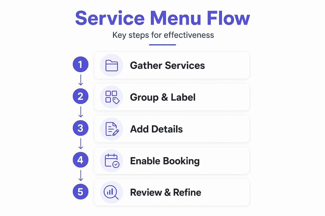
For service businesses, a service menu page is closely tied to the booking flow. It reduces hesitation by letting customers select a service with minimal confusion. Names, descriptions, pricing, and organization must match what the customer expects. That alignment between what you offer and how you present it is where optimization lives.
Follow these steps to get there:
-
Audit your current page. Print it out or open it on your phone. Read it as if you’ve never heard of your business. Note every point of confusion, every missing price, every vague description, and every service that sounds like another service.
-
Simplify your service list. Identify services that overlap or that rarely get booked. Consider merging, renaming, or removing them. A focused menu of 10 to 15 clearly distinct services outperforms a bloated list of 30 every time.
-
Rewrite descriptions with the client in mind. For each service, answer three questions: What is it? Who is it for? What result does the client get? Keep it to two to three sentences.
-
Add or update pricing. Even if your pricing is custom, give a starting point. “Projects starting at $500” tells the visitor whether they’re in the right place. It also pre-qualifies leads so you spend less time on calls that go nowhere.
-
Test your booking flow end to end. Click every button. Complete a test booking. Make sure the path from service selection to confirmation is smooth, fast, and free of errors.
-
Check mobile formatting. View your page on at least two different phone screen sizes. Ensure text is readable, buttons are tappable, and the layout doesn’t break.
-
Measure results. Use tools like Google Analytics or your booking platform’s built-in reporting to track where visitors drop off. If most people leave the page without clicking anything, the problem is clarity. If they click but don’t complete a booking, the problem is in the booking flow itself.
Statistic to know: Research consistently shows that reducing the number of choices available to customers increases conversion rates. Fewer, clearer options mean more completed bookings. This is why the most effective service menus are curated, not exhaustive.
Once you ensure your site supports seamless customer booking, you’ll likely see a measurable drop in abandoned sessions and a rise in completed bookings without changing anything else about your marketing.
What most businesses overlook about service menu pages
Here’s the honest perspective that most articles won’t give you. Business owners almost always want to add more to their service menu. More options, more detail, more descriptions. The instinct makes sense because you’ve worked hard to build a range of services and you want people to know everything you offer.
But that instinct works against you.
The businesses with the highest booking rates we’ve seen are almost never the ones with the most detailed menus. They’re the ones with the clearest menus. There’s a real difference. Clarity means a visitor can land on your page, identify their need, and take action in under 60 seconds. Detail means they have to read paragraphs before they understand what they’re even looking at.
Most business owners also underestimate how much their service menu reflects their brand. A cluttered, inconsistent menu signals a cluttered, inconsistent business. A clean, well-organized menu signals professionalism and competence before a single word is read. Visitors make that judgment call fast, often before they’ve read a single description.
The other thing most people miss: your service menu page is not a catalog. It’s a sales tool. Every decision about what to include, how to name it, and how to organize it should be made through the lens of what helps the visitor decide and take action. Not what feels complete or thorough to you as the business owner.
The best service menus act as a direct ambassador for your customer strategy. They say: “We know who you are, we know what you need, and here’s exactly how to get it.” That’s the standard worth building toward.
Ready to elevate your service menu page?
You now have a clear picture of what a high-performing service menu page looks like and what it takes to build one. But knowing the framework and executing it well are two different things.
At Cosmic Digital Studios, we specialize in creating custom-built, conversion-optimized websites and pages that guide your visitors from interest to action. Whether your service menu needs a full redesign or a focused optimization pass, we build it around your specific business goals and customer expectations. If you’re ready to stop losing bookings to a confusing page, let’s build your perfect service menu page together. Clean design, strong messaging, and real results.
Frequently asked questions
How is a service menu page different from a standard services page?
A service menu page uses organized categories and action-focused listings to make service selection faster and easier than a generic services list. As defined in service menu best practices, it presents offerings in a menu-style format with categories and individual services designed for quick browsing and booking.
Do I need to show prices on my service menu page?
Transparent pricing builds trust and reduces friction, but a “Contact for Quote” call to action is acceptable when rates genuinely vary by project scope. Effective service menus include transparent pricing and durations wherever possible to reduce hesitation.
How many services should I list on my menu page?
List enough to cover your main offerings, but group or simplify to avoid overwhelming clients and causing decision fatigue. The goal is to avoid overloading with similar options and instead simplify names, group related services, and remove low-differentiation listings that cause abandoned bookings.
Can the same service menu page serve retail and business customers?
Yes, as long as the menu organizes services by customer type or intent and descriptions clearly explain who each service is for. Using labeled sections like “For Individuals” and “For Businesses” makes the distinction immediately clear without requiring separate pages.