A high-converting coaching landing page is defined as a single-purpose page built to turn visitors into booked calls or enrolled clients through five structural levers: outcome-specific hero copy, a channel-agnostic delivery section, visible cohort caps, completion-focused testimonials, and a time-bound guarantee. Most coaches treat their landing page as a digital brochure. The ones who book consistently treat it as a conversion system. Structural improvements using these five levers can push conversion rates from 4–8% to over 25% on warm traffic. That gap represents the difference between a page that looks good and one that actually fills your calendar.
What are the essential elements of a high-converting coaching landing page?
Every coaching landing page that converts well shares the same core structure. Aesthetics matter, but structure drives decisions.
Outcome-specific hero copy
Your headline is the first thing a visitor reads, and it has one job: make them feel understood. Outcome-focused headlines outperform generic role statements every time. “Executive Coach for Senior Leaders” tells a visitor who you are. “Go from Burned-Out Manager to Confident Director in 90 Days” tells them what they get. The second version wins because it speaks to transformation, not credentials.

Write your hero copy around a specific result, a specific person, and a specific timeframe. Vague promises like “reach your potential” give visitors nothing to hold onto.
Channel-agnostic delivery section
Most coaches skip this section entirely. That is a costly mistake. The delivery section addresses the silent objection every prospect carries: “Will I actually do this?” Explain how your program works without locking it to a single format. Instead of “weekly Zoom calls,” say “live sessions you can join from anywhere, with recordings available.” This removes friction for prospects who travel, work odd hours, or feel uncertain about committing to a rigid schedule.
A clear delivery section increases completion confidence. Visitors who believe they can finish your program are far more likely to enroll.
Visible cohort caps
Open enrollment feels low-stakes. That is the problem. Pages with visible cohort caps convert 1.5 to 2.5 times higher than those with open enrollment. Real enrollment limits create genuine urgency, which aligns with how high-achievers make decisions. They act when they see a real reason to act now.
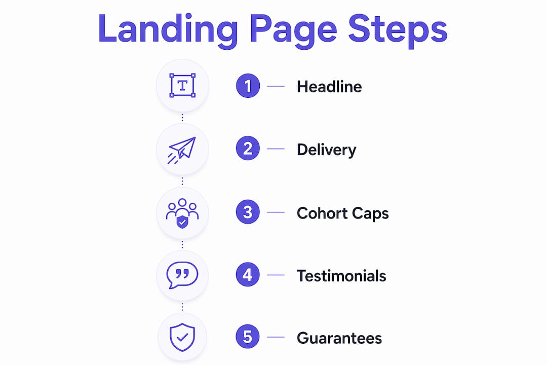
Show the cap clearly: “6 of 10 spots remaining” beats “limited availability” every time. Specificity makes scarcity believable.
Completion-focused testimonials
Generic testimonials like “Working with Sarah changed my life” do almost nothing for conversion. The action-result-time testimonial format converts 1.5 to 3 times better. A strong testimonial reads: “I completed the 8-week program and landed two new corporate clients within 30 days.” That structure gives prospects a clear picture of what they can expect. For guidance on the best testimonial layouts to use on coaching pages, the format and placement matter as much as the words.
Collect testimonials by asking clients three questions: What did you do? What happened? How long did it take?
Time-bound guarantees
A specific guarantee removes the final objection before the buy decision. Pages with a time-bound guarantee convert 1.3 to 2 times better than those with vague or no guarantees. “30-day results guarantee” is weak. “If you complete all five modules and do not book a single discovery call within 30 days, I will refund your investment” is specific, measurable, and credible.
Pro Tip: Write your guarantee to reflect confidence in your program, not fear of refunds. Specific guarantees signal that you stand behind your results.
Which tools and design features should you use to create an effective coaching landing page?
The right tools reduce build time and protect conversion. The wrong ones add friction for both you and your visitors.
Mobile responsiveness and fast load speed are non-negotiable. A page that loads slowly or breaks on a phone loses visitors before they read a single word. Prioritize clean, scrollable layouts with large tap targets and minimal pop-ups on mobile.
Content flow should follow the client decision sequence: problem recognition, solution awareness, proof, delivery clarity, urgency, and action. Place your CTA button above the fold, repeat it after testimonials, and include it again at the bottom of the page. Three placements is the standard for a coaching funnel landing page.
| Design Feature | Purpose | Priority |
|---|---|---|
| Outcome-driven headline | Communicates transformation immediately | Critical |
| Mobile-responsive layout | Reduces bounce on phone traffic | Critical |
| Fast load time | Keeps visitors engaged past the first second | Critical |
| Visible cohort cap | Creates real urgency for high-achievers | High |
| Completion-focused testimonials | Builds trust with specific social proof | High |
| Time-bound guarantee | Removes final objection before enrollment | High |
| Single, repeated CTA | Guides visitors to one action only | High |
| Channel-agnostic delivery section | Eliminates “can I actually do this?” doubt | Medium |
Brand consistency matters, but it should never compete with clarity. Use your brand colors and fonts, but keep the page visually simple. White space, short paragraphs, and bold subheadings all help visitors scan and decide faster. For a deeper look at coaching website design strategies that work in practice, real examples show how these principles apply across different niches.
What step-by-step process should coaches follow to build and optimize their landing pages?
Building a high-converting page is a process, not a one-time task. Follow these steps in order.
-
Define your single conversion goal. Every element on the page should push toward one action: book a call, join a waitlist, or enroll now. Remove anything that points elsewhere.
-
Write your outcome-driven hero section. Start with the transformation your client achieves, the specific person you serve, and the timeframe. Draft three versions and test the one that feels most specific.
-
Add your delivery section and testimonials. Explain how the program works in plain language. Place two to three completion-focused testimonials directly below the delivery section, where doubt is highest.
-
Set your cohort cap and guarantee. Display the enrollment limit prominently near the top and again near the CTA. Write your guarantee in one sentence with a clear condition and a clear outcome.
-
Launch and run a split test on one variable. Split testing one variable at a time clarifies what actually moves the needle. Start with your headline. Run the test until you have enough data to see a clear winner, then move to the next variable.
Pro Tip: Never test your headline and your CTA button at the same time. If conversions change, you will not know which element caused it. One change, one test, one conclusion.
The most common mistake coaches make is redesigning the entire page when results are flat. Changing only the headline, CTA text, or hero structure one at a time accelerates improvement without creating confusion. Treat your landing page as a living system, not a finished product.
For a complete walkthrough on how to build a coaching website from the ground up, the step-by-step process applies directly to landing pages as well.
What common mistakes reduce coaching landing page conversions?
Most coaching pages underperform for predictable reasons. Fixing these issues often produces faster gains than adding new content.
- Vague headlines. “Helping coaches grow their business” tells no one anything specific. Replace it with a result, a person, and a timeframe.
- Multiple calls to action. Asking visitors to book a call, download a guide, and follow you on social media splits their attention. Pick one action and remove the rest.
- Generic testimonials. Testimonials without specific results, timelines, or actions do not reduce purchase hesitation. Collect and display only the ones that follow the action-result-time format.
- Slow load times and broken mobile layouts. These kill conversions before your copy gets a chance to work. Test your page on a real phone, not just a browser preview.
- Misreading split test data. Ending a test too early or changing two variables at once produces misleading results. Give each test enough time to reach statistical significance before drawing conclusions.
“Most coaches believe long-form sales pages are required, but optimal conversion comes from addressing buyers’ implicit doubts through clear program delivery explanations. Length is not the lever. Clarity is.”
The fix for most of these problems is subtraction, not addition. Remove the extra CTAs. Shorten the bio section. Cut the testimonials that lack specifics. A leaner page with sharper copy almost always outperforms a longer page with diluted messaging. If your page is not converting, check why your coaching website fails to book clients before adding more content.
Key Takeaways
A high-converting coaching landing page requires five structural levers: outcome-specific copy, delivery clarity, visible cohort caps, completion-focused testimonials, and a time-bound guarantee.
| Point | Details |
|---|---|
| Outcome-specific hero copy | Write headlines around a specific result, person, and timeframe, not your job title. |
| Visible cohort caps | Real enrollment limits convert 1.5 to 2.5 times better than open enrollment. |
| Completion-focused testimonials | Use the action-result-time format to reduce purchase hesitation with specific proof. |
| Time-bound guarantees | Specific, measurable guarantees convert 1.3 to 2 times better than vague ones. |
| Split test one variable | Change only one element per test to identify what actually improves conversion. |
What I have learned from coaching pages that actually convert
The coaches who book the most clients from their landing pages are rarely the ones with the most polished design. They are the ones who treat their page like a system and test it like a scientist.
The biggest mindset shift I have seen make a real difference is moving from “How does this look?” to “What does this make the visitor feel and do?” Those are completely different questions. One leads to beautiful pages that sit empty. The other leads to pages that fill cohorts.
Process discipline matters more than aesthetics here. I have watched coaches spend weeks on color palettes and fonts while leaving a vague headline and zero testimonials on the page. The headline is worth ten times more than the font choice. Fix the copy first, always.
The delivery section is the most underrated element on any coaching page. Prospects rarely say out loud, “I am not sure I can commit to this format.” But that doubt kills enrollments silently. When you explain your program in a way that removes scheduling friction, you answer a question the visitor never asked but absolutely needed answered.
Testing one variable at a time feels slow. It is not. It is the only way to know what is actually working. Coaches who test randomly or redesign everything at once spend months going in circles. Coaches who test one element per cycle compound their improvements fast.
— Max
How Cosmicdigitalstudios helps coaches build pages that convert
If you are ready to put these principles into practice, Cosmicdigitalstudios builds custom landing pages and coaching funnels designed around conversion, not just appearance.
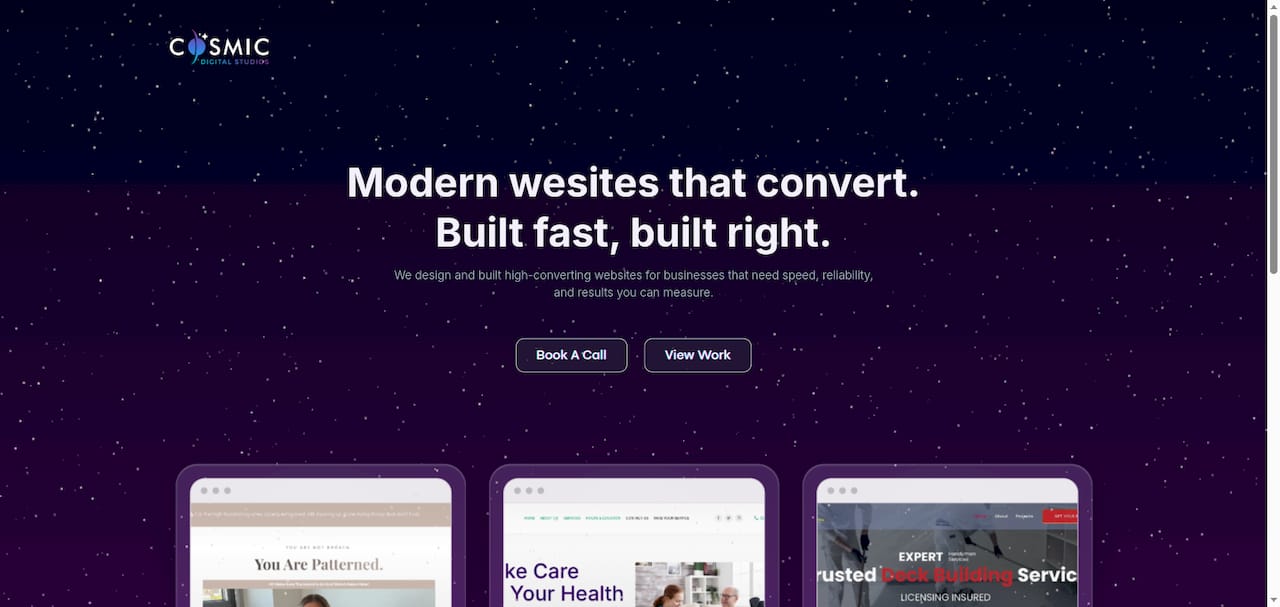
Every build at Cosmicdigitalstudios starts with your conversion goal and works backward through copy, structure, and design. The team specializes in fast, modern pages that communicate clearly and guide visitors toward booking. Whether you need a single landing page or a full coaching website that converts, the process is built around your specific offer and audience. Clean design, strong messaging, and real results.
FAQ
What is a high-converting coaching landing page?
A high-converting coaching landing page is a single-purpose page built around five structural levers: outcome-specific hero copy, a delivery section, visible cohort caps, completion-focused testimonials, and a time-bound guarantee. These elements work together to move visitors from interest to enrollment.
How do cohort caps increase coaching page conversions?
Visible enrollment limits create genuine scarcity that aligns with how high-achievers make decisions. Pages with real cohort caps convert 1.5 to 2.5 times higher than those with open enrollment.
What makes a coaching testimonial convert well?
Testimonials that follow the action-result-time format (“I completed X and got Y in Z time”) convert 1.5 to 3 times better than general satisfaction quotes. Specificity is what builds trust.
How often should I split test my coaching landing page?
Test one variable at a time and run each test until you have a clear winner before moving to the next. Changing only one element per test prevents confusion and accelerates real improvement.
Does page length affect coaching landing page conversion rates?
Length alone does not determine conversion. Addressing buyers’ implicit doubts through clear delivery explanations and specific proof matters far more than word count. A shorter, clearer page consistently outperforms a longer, vague one.