Your coaching website looks great. The branding is clean, the copy sounds professional, and you spent weeks getting it right. But the bookings aren’t coming in. Visitors land on your page, scroll for a few seconds, and leave without taking any action. This is one of the most common and frustrating problems coaches face online. The issue usually isn’t your offer or your expertise. It’s that your website isn’t built as a conversion funnel. This guide breaks down exactly how to fix that, from understanding funnel stages and setting up the right tools, to building each page, troubleshooting weak spots, and measuring results that actually matter.
Table of Contents
- Understanding the coaching website funnel
- Prepare: Must-have tools and assets for high conversion
- Build: Step-by-step process to launch your funnel
- Verification and troubleshooting: Fixing leaks for better results
- Why focusing on copy and friction beats flashy design changes
- Get expert help building your high-converting coaching website
- Frequently asked questions
Key Takeaways
| Point | Details |
|---|---|
| Funnel stages matter | Break your coaching client journey into clear funnel stages to focus improvements for better conversions. |
| Prioritize clarity and proof | Make your value clear and show evidence near calls-to-action to maximize leads and bookings. |
| Automate and reduce friction | Use streamlined tools, scheduling embeds, and short forms to make taking action effortless for prospects. |
| Test before redesigning | Fix copy, offers, and proof first before investing in flashy visual changes that rarely deliver major lifts. |
Understanding the coaching website funnel
A funnel isn’t just a marketing buzzword. For coaches, it’s the structured path that takes a cold visitor and moves them toward becoming a paying client. Every step in that path has a job to do, and when one step fails, the whole system breaks down.
A high-converting coaching website typically works as a multi-stage sequence: lead magnet or offer, nurture emails, discovery call booking, show up, and enrollment. Each stage has its own conversion goal, and each one feeds the next. If you’re only measuring whether people “contact you,” you’re missing the full picture.
For higher ticket coaching, the funnel is fundamentally an automated, repeatable sequence that converts through landing pages, email marketing, and sales page steps, often culminating in scheduling a call. That automation is what makes your website work while you’re busy coaching actual clients.
Here are the typical benchmarks you should be tracking at each stage:
| Funnel stage | Healthy benchmark |
|---|---|
| Lead magnet opt-in rate | 20–40% |
| Email open rate | 30–50% |
| Discovery call booking (from list) | 5–15% |
| Show rate (calls attended) | 75–85% |
| Enrollment rate (from calls) | 25–35% |
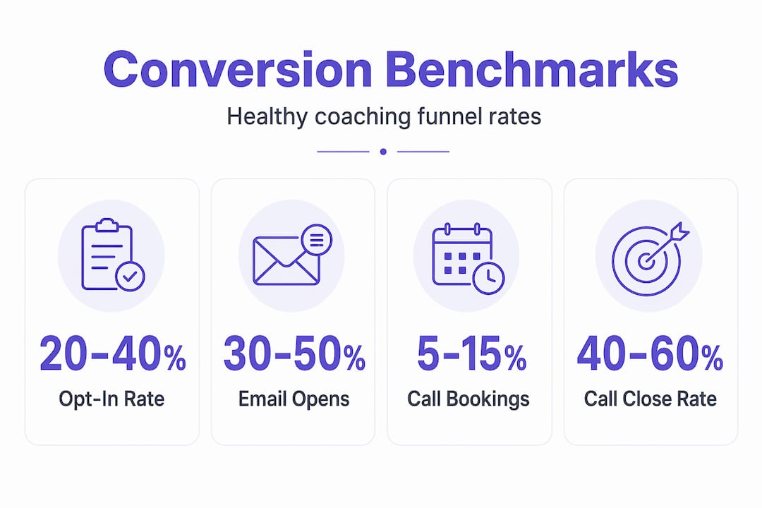
These numbers give you a baseline. If your opt-in rate is 5%, you know the lead magnet or landing page needs work. If your show rate is 40%, you need a better confirmation and reminder sequence. Benchmarks tell you exactly where to focus.
Key funnel components every coaching website needs:
- A lead magnet with a dedicated opt-in landing page
- An automated email nurture sequence (at least 3 to 5 emails)
- A booking page with embedded scheduling
- A thank-you or confirmation page that sets expectations
- A sales or services page that handles objections
- Social proof placed near every call to action
Treat your funnel as a pipeline of distinct metrics, not a single conversion event. When you measure opt-in rates, open rates, booking rates, show rates, and enrollment rates separately, you can fix the exact stage that’s leaking instead of guessing.
Prepare: Must-have tools and assets for high conversion
Once you understand the funnel’s structure, you need the right setup to execute efficiently. Choosing the wrong tools early on creates technical debt that slows everything down later.

Automating, repeating, and scaling your funnel relies on three core tool categories: landing page builders, email marketing platforms, and embedded scheduling tools. Here’s how the most popular options compare:
| Category | Option A | Option B | Best for |
|---|---|---|---|
| Scheduling | Calendly | Acuity Scheduling | Calendly for simplicity; Acuity for intake forms and packages |
| Email marketing | Mailchimp | ConvertKit | Mailchimp for beginners; ConvertKit for automation and tagging |
| Landing pages | Leadpages | Carrd | Leadpages for full funnels; Carrd for simple, fast opt-in pages |
| CRM integration | HubSpot Free | ActiveCampaign | HubSpot for basic tracking; ActiveCampaign for advanced sequences |
Beyond tools, you need content assets ready before you build a single page. Trying to write copy and build pages at the same time leads to rushed messaging and weak results.
Asset checklist before you start building:
- Professional headshot and brand photos
- Your core offer clearly defined (who it’s for, what they get, what changes)
- At least 3 to 5 client testimonials with specific, results-focused language
- Your lead magnet created and ready to deliver (PDF guide, video, checklist)
- A clear value proposition written in plain language your ideal client would use
- Your booking availability set and calendar synced
You can explore modern coaching website tools that integrate seamlessly with these platforms to avoid the headache of stitching together disconnected systems.
Pro Tip: Choose tools that sync your scheduling directly to your email list and CRM. When someone books a call, they should automatically be tagged in your email system. This lets you send targeted follow-ups, reminders, and post-call sequences without manual work.
Build: Step-by-step process to launch your funnel
With the tools and content in hand, let’s walk through the process from zero to a live, effective funnel. Skipping steps here is where most coaches lose conversions before they even launch.
Write your core value proposition first. Before touching any design tool, get clear on who you help, what specific result you deliver, and how you’re different. This single statement will drive every headline on your site.
Build your lead magnet landing page. Keep it focused. One offer, one opt-in form, no navigation links to distract visitors. Your headline should speak directly to the problem your ideal client is trying to solve right now.
Set up your email nurture sequence. Write at least 3 emails: a welcome email that delivers the lead magnet, a value email that shows your expertise, and a booking invitation email with a clear call to action. Space them 2 to 3 days apart.
Create your booking page. Embed your scheduling tool directly on the page rather than linking out to an external site. Simplifying the path to booking is a major conversion lever for coaching and consulting websites. Every extra click you add is a drop-off risk.
Build your main services or sales page. This page should address the transformation you offer, handle common objections, and place your booking CTA in at least three locations: above the fold, after your testimonials, and at the bottom of the page.
Add social proof strategically. Don’t dump all testimonials on one page. Place relevant proof near every CTA. A short quote from a past client right above your booking button is far more powerful than a testimonials page nobody visits.
Set up your thank-you and confirmation pages. After someone opts in or books, tell them exactly what happens next. Uncertainty kills momentum. A clear next step keeps people engaged.
Connect all integrations and test every flow. Make sure your opt-in form tags subscribers correctly, your scheduling tool sends confirmation emails, and your CRM records every contact.
Prioritizing intent clarity, friction reduction, and trust signals near your primary CTA before redesigning anything else can produce conversion improvements in the 50 to 200% range. That’s not from a new logo or a color change. It’s from getting the fundamentals right.
A conversion-driven website structure makes this process faster and ensures each page has a clear job to do within the funnel.
Pro Tip: Test your entire booking flow on a mobile device before you launch. More than half of your visitors will be on their phones. If the scheduling embed is hard to tap or the form requires too many fields, you’ll lose bookings before they happen. Ask a friend or colleague to go through the process cold and note where they get confused.
Verification and troubleshooting: Fixing leaks for better results
After launch, it’s vital to check if each part of your funnel performs and know how to fix what’s broken. Most coaches launch and hope. The ones who scale consistently launch and measure.
Start by reviewing each stage against the benchmarks from the table above. If your opt-in rate is below 20%, the problem is usually your headline, your lead magnet offer, or your traffic quality. If your booking rate is below 5%, the issue is likely your email sequence or your offer clarity. If your show rate is below 75%, you need a stronger confirmation and reminder system.
Common funnel mistakes that kill conversions:
- Opt-in forms with too many required fields (name, email, phone, company all at once)
- An unclear or generic offer (“free consultation” instead of “30-minute strategy call to map out your 90-day plan”)
- Weak or vague testimonials that don’t mention specific results
- CTAs buried at the bottom of long pages with no visual emphasis
- No follow-up sequence after someone opts in but doesn’t book
- A booking page that links out to a third-party site instead of embedding the calendar
CRO for coaches should always start with these fundamentals before touching anything visual.
The biggest conversion gains don’t come from changing button colors or fonts. CRO best practices consistently show that fixing intent clarity, reducing friction, and adding proof near CTAs drives the real results. Design tweaks are finishing touches, not foundations.
Once you’ve addressed the obvious issues, run A/B tests on your highest-traffic pages. Test one variable at a time: your headline, your CTA button text, or the placement of your testimonials. Give each test at least two weeks and enough traffic to produce statistically meaningful data before drawing conclusions.
Treating your funnel as a pipeline of distinct metrics means you’re never guessing which part needs attention. You’re reading the data and acting on it with precision.
Why focusing on copy and friction beats flashy design changes
Here’s something most coaches don’t want to hear: your website’s design is probably not why you’re not getting bookings. We’ve worked with enough coaching websites to say this confidently. The ones that convert aren’t always the most visually impressive. They’re the ones with the clearest message and the fewest barriers between a visitor and a booked call.
CRO guidance consistently stresses starting with your messaging and value proposition, your social proof, and your friction points before spending money or time on design changes. Yet coaches routinely do the opposite. They tweak colors, swap fonts, and redesign headers while their core offer is buried three scrolls down the page with no clear CTA in sight.
The uncomfortable truth is that a well-written headline on a plain page will outperform a beautifully designed page with weak copy almost every time. Your ideal client isn’t evaluating your Pantone choices. They’re scanning for one thing: “Is this person the right fit for my problem?” If your messaging answers that question fast and clearly, they’ll book. If it doesn’t, no amount of design polish will save you.
What actually moves the needle is this: a bold, specific value proposition in the first five seconds of the page, a lead magnet that solves a real and immediate problem, a booking process with zero unnecessary steps, and testimonials that speak to the exact transformation your ideal client wants. These are the advanced CRO insights for coaches that separate sites generating consistent leads from sites that just look good in screenshots.
The lesson here isn’t to ignore design. Clean, professional design builds trust and credibility. But design should support your message, not replace it. Get the words and the flow right first. Then refine the visuals.
Get expert help building your high-converting coaching website
If you’ve read this far, you have a solid blueprint for building a coaching funnel that actually converts. Following this plan yourself is absolutely possible, and for coaches who enjoy the technical side, it can be a rewarding process.
But if you’d rather skip the trial and error, avoid the costly mistakes that come from learning as you go, and get a professionally built funnel that’s ready to generate leads from day one, that’s exactly what we do at Cosmic Digital Studios. We build professional coaching website builds and conversion-focused funnels tailored to your offer, your audience, and your goals. Clean design, strong messaging, and a structure built to convert. Book a discovery call with our team and let’s map out what your site needs to start generating real results.
Frequently asked questions
What is a healthy conversion rate for a coaching website funnel?
Healthy coaching funnel benchmarks include a lead magnet opt-in rate of 20 to 40%, a discovery call booking rate of 5 to 15% from your email list, and an enrollment rate of 25 to 35% from attended calls. Use these numbers to identify exactly which stage needs attention.
How important is embedding scheduling directly in the website?
Embedding scheduling removes friction by eliminating extra clicks and redirects, which directly reduces drop-offs and increases your booking rate. Linking out to an external scheduling page adds unnecessary steps that cost you bookings.
Should I focus on design changes like colors and layouts first?
No. CRO best practices consistently show that fixing your copy, value proposition, CTAs, and social proof produces far greater conversion improvements than visual design changes. Start with messaging and friction, then refine the design.
What’s the first thing to fix if my funnel isn’t converting?
Check for friction and clarity issues first. CRO prioritization starts with asking whether your offer is immediately clear and whether booking a call or opting in requires as few steps as possible. Simplify both before anything else.