Your website menu is one of the first things a visitor uses to decide whether to stay or leave. If it’s cluttered, vague, or buried under too many layers, people bounce before they ever see your services. Learning how to properly structure a service business website menu means fewer confused visitors, faster decisions, and more booked calls. This guide walks you through preparation, execution, and measurement so you can build a menu that works as hard as the rest of your site.
Table of Contents
- Key takeaways
- What to know before you structure your menu
- Step-by-step guide to structuring your menu
- Common mistakes that hurt conversions
- How to measure menu performance over time
- My honest take on what actually works
- Ready to build a menu that actually converts?
- FAQ
Key takeaways
| Point | Details |
|---|---|
| Start with service clarity | Define your core services and map user intent before you touch a single menu label. |
| Use a services hub page | A dedicated hub page routes visitors to the right service without overloading the top menu. |
| Keep top-level items to 4–6 | Fewer menu items reduce cognitive load and keep visitors focused on conversion paths. |
| Treat menu changes as experiments | Test navigation updates with real data instead of making redesigns based on gut feeling. |
| Accessibility is non-negotiable | Keyboard-navigable menus expand your audience and directly support conversions. |
What to know before you structure your menu
Before you move a single link, you need a clear picture of what your business offers and who you’re building the menu for. Skipping this step is the fastest way to end up with a menu that looks organized but doesn’t actually help anyone make a decision.
Start by writing down every service you offer. Then group them into logical clusters. A property management company, for example, might group “tenant screening,” “lease management,” and “maintenance coordination” under a single residential services category. That grouping reflects how a potential client thinks, not how your internal team categorizes work.
Next, map your customer’s decision journey. Ask yourself: what does someone need to know before they’re ready to book? Most service buyers go through awareness, comparison, and commitment. Your menu structure should mirror that path, placing your most-visited content closest to the surface.
SEO matters here too. Dedicated service pages for each specialty or location help Google understand what you offer and rank you accordingly. One generic “Services” page that tries to cover everything is a missed opportunity, both for the algorithm and for the visitor scanning to see if you solve their specific problem.
Pro Tip: Write your menu labels using the exact words your clients use when they call or email you. If they say “bookkeeping help” and your menu says “financial reconciliation services,” you’ve already lost them.
Finally, think about accessibility from the start. About 26% of U.S. adults live with a disability that can affect how they use a website. Building keyboard-accessible menus from day one is far easier than retrofitting compliance later.
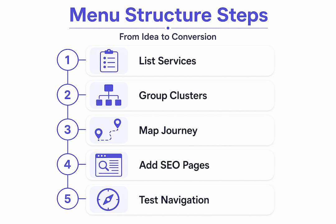
Step-by-step guide to structuring your menu
Here’s how to build a menu structure that serves both users and search engines without overwhelming either.
-
Choose a simple global menu format. Your header navigation should answer one question: where do I go first? Global header menus for multi-service providers work best when they focus on decision points like Services, About, and Contact. Everything else belongs deeper in the site.
-
Limit your top-level items to 4–6. Keeping the main menu to 5–7 items protects cognitive load and keeps visitors focused. When everything is visible at once, nothing feels urgent or clear. Pick only the categories that serve a decision-making purpose.
-
Create a services hub page. This is the most underused tool in service business website layout. The hub page acts as a routing decision page. A visitor lands there, quickly understands the categories you serve, and self-selects the most relevant option. Think of it as a directory, not a sales page. A strong hub page quickly answers whether the visitor fits your service and sends them to the right place without forcing them through a long catalog. You can learn more about how this works in practice on the service menu page guide from Cosmicdigitalstudios.
-
Build dedicated pages for each service. Each service deserves its own page with a clear headline, a description of the outcome, social proof, and a strong call to action. This structure supports both SEO and clarity. Dedicated pages with 600–800 words of focused content give Google enough signal to rank you and give visitors enough information to decide.
-
Use dropdowns with restraint. If you need them, keep your navigation depth to a maximum of two levels. Deeper hierarchies cause confusion because users cannot easily remember where they came from or where to go next. If you have more than two levels, you have a content organization problem, not a menu problem.
-
Write labels with strong information scent. “What We Do” tells a visitor nothing. “Web Design for Contractors” tells them exactly who this is for. Every label in your menu should make someone think “yes, that’s what I need” or “no, that’s not for me.” Both outcomes are wins. Vague labels just create dead ends.
-
Make your menu keyboard accessible. WCAG 2.2 requires that menus be fully operable by keyboard, including Tab to move through items, Enter or Space to open dropdowns, Escape to close them, and visible focus indicators so users know where they are. This is not a stretch goal. It is the standard.
Here’s a reference for common menu structure patterns and when to use each:
| Menu style | Best for | Key benefit |
|---|---|---|
| Simple flat menu | Businesses with 4–5 distinct service categories | Fastest decision path, minimal cognitive load |
| Hub page with dropdown | Multi-service businesses | Routes visitors efficiently without header clutter |
| Tabbed local navigation | Services with sub-options or pricing tiers | Keeps detail off the global menu |
| Mega menu | Large enterprises with many divisions | Only works when all categories are truly distinct |
Pro Tip: Add local navigation via tabs inside your services hub page to handle pricing details or deliverables without adding items to your global menu.

Common mistakes that hurt conversions
Even well-intentioned menus can quietly kill your conversion rate. Here are the patterns worth watching for.
- Too many top-level items. Once you cross six or seven main items, visitors stop reading carefully and start scanning anxiously. Every item added above six is a vote against every other item. Keep the list tight.
- Jargon in labels. Internal team language never belongs in a customer-facing menu. If your team calls a service “client lifecycle management” but your clients call it “onboarding support,” use their words.
- Navigation depth beyond two levels. A poorly structured menu causes visitors to backtrack, get frustrated, or leave entirely. When someone has to remember three levels of navigation to find a page, they won’t. They’ll leave instead.
- Treating your menu like a catalog. Your menu is not a list of everything you sell. It is a guide to the decision your visitor needs to make next. If your services hub has thirty items, it is a catalog. Cut it down to the categories that reflect real decision paths.
- Inaccessible dropdown menus. If a dropdown only opens on hover and has no keyboard support, you’ve cut off a significant portion of your potential clients. Mobile users, keyboard-only users, and assistive technology users all need functional menu access.
“The best menus don’t show visitors everything at once. They show visitors what they need to see to take the next step.”
Test every route from your services hub page manually. Click through every link. Make sure every path reaches a dedicated service page with a clear call to action and no dead ends.
How to measure menu performance over time
Structuring your menu is not a one-time task. It’s a process you refine based on real behavior data.
-
Set up click tracking on your menu. Use your analytics platform to see which menu items get the most clicks, which get ignored, and where drop-offs happen between the menu and your conversion pages. This data tells you what visitors are actually looking for versus what you think they want.
-
Run navigation-specific conversion tests. Navigation changes strongly impact both SEO and lead generation. Treat each menu change as a testable hypothesis. Moving a high-value service higher in the menu can disproportionately increase qualified leads. Don’t guess. Measure.
-
Collect user feedback at friction points. Short on-page surveys at the bottom of your services hub page asking “Did you find what you were looking for?” give you qualitative insight that click data alone cannot provide.
-
Iterate on labels before restructuring. If a service page has low traffic from the menu, change the label first. A label change takes five minutes and can double click-through rate before you commit to a full layout redesign.
-
Add breadcrumbs for deeper structures. If your site has three or more navigation levels, breadcrumb navigation helps users see where they are and reduces backtracking. It also gives search engines additional context about your page hierarchy.
You can also find a useful breakdown of essential website pages that should support your menu structure at Cosmicdigitalstudios.
My honest take on what actually works
I’ve reviewed dozens of service business websites where the menu looked clean on the surface but buried the most important service three clicks deep. The business owner spent months on their branding and ignored navigation entirely. That’s backwards.
The services hub page is the piece most service businesses get wrong. Either they skip it and dump everything into a dropdown, or they build one but fill it with vague category names that mean nothing to a first-time visitor. Vague hub pages cause backtracking instead of progression. Specificity is what converts.
What I’ve learned from working through site after site is that accessibility is not a compliance checkbox. It is a conversion lever. When your menu works via keyboard, loads fast on mobile, and uses keyboard operability standards correctly, more people complete their intended path. More completions mean more leads.
The hardest mindset shift for most business owners is accepting that their menu is a funnel event, not a design element. Every label, every order, every depth decision either moves someone closer to booking or gives them a reason to hesitate. Test it like you’d test an ad headline. The data will tell you more than any design opinion ever will.
— Max
Ready to build a menu that actually converts?
A well-structured menu is one piece of a larger conversion system. If your website navigation is losing you leads every day, it’s time to fix the whole picture.
At Cosmicdigitalstudios, we build custom service websites with navigation structures designed around your specific services, your client’s decision journey, and your conversion goals. Every menu we design is accessible, SEO-friendly, and built to guide visitors toward booking, not just browsing. From services hub pages to dedicated service pages with clear calls to action, every element has a purpose. If you’re ready for a site that performs, explore what a complete website build looks like when it’s done right.
FAQ
How many items should a service website menu have?
Keep your top-level menu to 4–6 items. Research shows that exceeding seven items causes cognitive overload and reduces the likelihood that visitors take action.
What is a services hub page?
A services hub page is a dedicated routing page that lists your service categories with brief previews, helping visitors quickly self-select the right service without requiring a long dropdown menu in your header.
How deep should my website navigation go?
Navigation depth should stay at two levels maximum. Users struggle to remember paths beyond two levels, which leads to backtracking and higher bounce rates.
Does menu structure affect SEO?
Yes. Dedicated service pages linked through a clear menu hierarchy help search engines index your content correctly. Moving key services higher in the menu also impacts how much link authority and traffic those pages receive.
How do I know if my menu is hurting conversions?
Check your analytics for high drop-off rates between menu clicks and conversion pages. If visitors land on your services hub but don’t click through to individual service pages, your labels or hub page structure needs refinement.