
Your hero section is the single most important block on your local business website. It sits above the fold, loads before anything else, and tells every visitor within seconds whether they’re in the right place. Get it right, and visitors stay, read, and take action. Get it wrong, and they bounce before they ever see your services, your reviews, or your contact form.
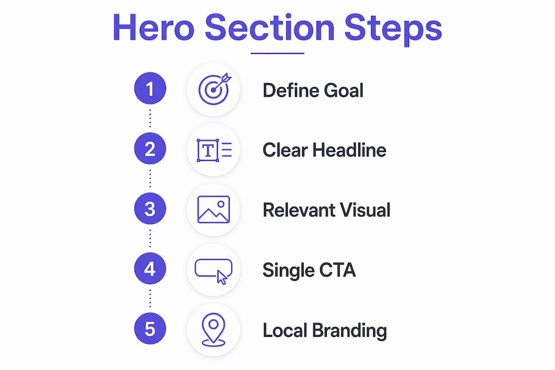
The hero section, sometimes called the above-the-fold block, is the full-width visual and messaging area at the very top of your homepage. It typically combines a headline, a supporting subheading, a visual or video, and a primary call to action (CTA). For local businesses, it does something even more specific: it signals to a nearby visitor that your business serves them, understands their problem, and is ready to help right now.
Here’s what an effective hero section accomplishes for a local site:
- Establishes immediate relevance so visitors know they’ve landed in the right place
- Communicates your core value proposition in plain, outcome-focused language
- Guides visitors toward one specific action, whether that’s calling, booking, or requesting a quote
- Reflects local identity and community connection through authentic visuals and location-aware messaging
- Reduces bounce rate by removing confusion about what you offer and who you serve
Users spend most of their attention above the fold, which means your hero carries a disproportionate share of your site’s conversion weight. Every other page, every service description, every testimonial only gets read if the hero earns that scroll.
What goes into a high-performing hero section for local sites
A strong hero section isn’t about looking impressive. It’s about communicating clearly, fast. Each component has a specific job, and when they work together, the result is a visitor who immediately understands your offer and knows what to do next.
- Headline: States your unique value proposition in outcome-focused language. Not “Welcome to Smith Plumbing” but “Fast, Reliable Plumbing in Austin, TX, Available Today.” The headline and primary CTA carry the most weight in influencing visitor action compared to any other hero element.
- Subheading: Adds context and reinforces the headline’s promise. One sentence. Specific. It should name a result, a differentiator, or a mechanism, not repeat the headline in different words.
- Visual or video: Reflects your local identity. A real photo of your team, your storefront, or your work in the community outperforms any stock image. The visual should complement the text, not compete with it.
- Primary CTA: One button, one action verb, one clear next step. “Get a Free Quote,” “Book Your Appointment,” or “Call Us Now” all work. “Learn More” does not.
- Light social proof: A star rating, a client logo row, or a short trust badge placed near the CTA builds credibility without cluttering the layout. Trust signals near the CTA bolster visitor trust and conversion likelihood.
Simplicity is the discipline here. Every element you add competes for attention. The goal is coherence, not completeness.

Best practices for designing a hero section that actually converts
Design decisions in the hero section have direct consequences on whether visitors stay or leave. These aren’t aesthetic preferences. They’re conversion levers.
- Use visual hierarchy to control the gaze. The visitor’s eye should move from headline to value proposition to CTA in a straight, logical path. Conflicting visuals degrade conversion by pulling attention away from that path.
- Limit elements ruthlessly. One primary action above the fold. Every additional CTA reduces click-through on the main one because visitors click the lower-commitment option instead.
- Design mobile first. Your hero stacks vertically on a phone. If your CTA gets pushed below the fold by a large product image, you’re losing clicks from visitors who would have acted immediately.
- Use authentic local visuals. A photo of your actual team or your real service area builds trust faster than polished stock imagery. Visitors want to see who they’re hiring.
- Keep load time under three seconds. Slow images kill engagement before the hero even renders. Compress images, use modern formats like WebP, and test on real mobile connections.
- Avoid rotating carousels. Rotating sliders reduce engagement compared to a single, static image or short looping video. Pick your strongest visual and commit to it.
- Place trust signals above the CTA, not in the footer. A review score or logo row at the hero level tells visitors you’re legitimate before they have to decide whether to click.
- Test everything with data, not opinion. A/B test your headline first, then CTA copy, then the visual. Run on-site surveys and heatmaps to understand what visitors actually do. The winning hero is found in data, not taste.
Pro Tip: Before running any A/B test, read your hero section as a first-time visitor. Can you tell what the business offers, who it serves, and what to do next, without scrolling? If not, rewrite the headline before you test anything else.
How the hero section drives engagement and lifts conversions on local websites
Hero sections are the most common location for conversion leaks, ahead of pricing pages, checkout flows, and signup forms. That’s not because local business owners don’t care about their homepage. It’s because the mistakes are structural and invisible without a diagnostic.
The psychology is straightforward. Visitors arrive with a question: “Is this for me?” The hero section has roughly five seconds to answer it. If the headline leads with the company name or a vague tagline, the visitor can’t answer that question and leaves. If the headline leads with a specific outcome (“Same-Day HVAC Repair in Denver”), the visitor immediately knows they’re in the right place.
The hero section acts as a filter. If visitors can’t tell what the business is, who it serves, and what action to take within five seconds of landing, they leave. That’s not a design problem. It’s a messaging problem.
Vague messaging and multiple CTAs compound each other. When a visitor sees “Learn More,” “Get a Quote,” and “Watch Our Video” all above the fold, they face a decision they didn’t come to make. Most choose none of them. A clear, focused hero section lowers bounce rate, increases time on page, and lifts click-through to the next step.
For local businesses specifically, community relevance multiplies these effects. A visitor searching “roof repair near me” who lands on a hero that shows a local crew, mentions their city, and offers a same-day inspection call is far more likely to convert than one who lands on a generic homepage with no geographic signal. Local branding in the hero isn’t just aesthetics. It’s a conversion tactic. You can explore how this fits into your full homepage conversion strategy with a structured checklist built specifically for local service sites.
What effective hero sections look like on local business websites
The best local business hero sections share a pattern: one clear outcome in the headline, one visual that shows the real business, and one CTA that makes the next step obvious. Here’s how that plays out across different business types.
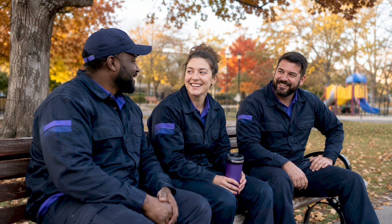
A local HVAC company leads with “Same-Day Heating and Cooling Repair in Phoenix, AZ” over a photo of their uniformed technicians. The CTA reads “Schedule Your Repair.” A five-star rating with a review count sits directly above the button. No carousel. No secondary links. Just a clear offer and a clear next step.
A neighborhood dental practice uses a warm photo of their actual front desk team, a headline that reads “Gentle Family Dentistry in Naperville, Accepting New Patients,” and a CTA that says “Book Your First Visit.” Below the button, a single line reads “Most insurance accepted.” That one detail removes a common objection without cluttering the layout.
A local law firm keeps the visual simple: a professional headshot of the lead attorney against a clean background. The headline focuses on the outcome: “Protecting Your Rights After an Accident in Atlanta.” The CTA is “Get Your Free Case Review.” No stock courthouse photo. No generic “experienced and dedicated” copy.
The common thread across all three: clarity about what the business does, who it serves, and what to do next. Visual storytelling choices in the hero, including how imagery reinforces your value proposition, directly affect whether visitors feel confident enough to click.
Common mistakes that kill hero section performance on local sites
Most hero sections underperform for the same handful of reasons. Recognizing them is the first step to fixing them.
Company-centric headlines are the most common mistake. “Welcome to Johnson Landscaping, Serving the Community Since 1998” tells the visitor nothing about what they get. Rewrite it around the visitor’s outcome: “Lush, Low-Maintenance Lawns in Sacramento, Guaranteed.”
Multiple CTAs above the fold split attention and reduce primary action clicks. Every additional button is a fork in the road. Visitors who face too many choices often take none. Collapse to one primary CTA and move secondary options below the fold as text links.
Visual clutter with no hierarchy makes the hero feel busy without communicating anything. When the background image, the headline, the logo, a badge, and a video play button all compete for the eye at once, nothing wins. Strip it back to the essential three: headline, visual, CTA.
Slow-loading imagery is a conversion killer that most local business owners don’t track. A hero image that takes four or five seconds to load on a mobile connection means the visitor sees a blank or broken page first. Compress every image and test your load speed with Google PageSpeed Insights.
Generic stock photos signal inauthenticity. A smiling model in a hard hat who has never touched a wrench doesn’t build trust with a visitor who needs a real plumber. Use photos of your actual team, your real work, or your genuine service area.
Weak CTA copy like “Click Here” or “Submit” removes urgency and specificity. The CTA should name the action and the benefit: “Get My Free Estimate” beats “Submit” every time. See how these principles apply across your full site structure in the essential pages for local service businesses.
How to tailor your hero section to reflect local branding and community
A hero section built for a local audience does more than display your city name. It signals that you belong to the community you serve, and that signal builds trust faster than any testimonial.
Start with your visuals. Use photos taken in your actual service area: your team in front of a recognizable local landmark, your vehicle on a street your customers recognize, or your work on a property in the neighborhood. These details are invisible to an outsider but immediately meaningful to a local visitor.
Your headline should include a geographic signal, but it should still lead with the outcome. “Trusted Electricians in Charlotte, NC” works. “Charlotte’s Most Trusted Electricians Since 2005” works even better because it layers local identity with a credibility claim. What doesn’t work is burying the city name at the bottom of the page where no one sees it.
Community language matters too. If your customers call it “the Triangle” instead of “Raleigh-Durham,” use that. If your service area has a local nickname, use it. Matching the language your customers actually use in the hero headline creates an immediate sense of recognition. For deeper guidance on writing local homepage copy that converts, the local business home page guide from Cosmicdigitalstudios walks through the full messaging process.
Color and typography should align with your brand identity, but they should also feel appropriate for your market. A family-owned bakery in a small Southern town and a tech-forward coworking space in Austin both need clear, professional hero sections. The visual tone, however, should match what the local audience expects from that type of business.
Key Takeaways
A well-built hero section on a local business website is the single highest-leverage element for reducing bounce rate, establishing relevance, and driving primary CTA clicks from local visitors.
| Point | Details |
|---|---|
| Hero section conversion weight | Users spend most of their attention above the fold, making the hero your site’s primary conversion driver. |
| Headline and CTA matter most | The headline and primary CTA carry more influence on visitor action than any other hero element. |
| One CTA above the fold | Multiple CTAs reduce primary action clicks; collapse to one specific, action-driven button. |
| Avoid rotating carousels | Rotating sliders reduce engagement by 20–40%; a single static image or short video performs better. |
| Local visuals build trust faster | Authentic photos of your real team and service area outperform stock imagery for local audiences. |
Ready to build a hero section that actually converts?
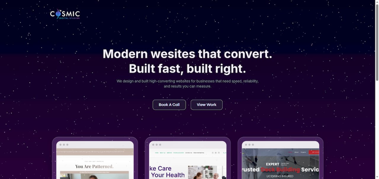
At Cosmicdigitalstudios, we build custom websites designed to turn visitors into booked calls and paying clients. Every site we build starts with a conversion-focused hero section, built around your specific offer, your local market, and your customers’ real language.
If your current hero section isn’t doing its job, we can fix that. Whether you need a full website redesign or a focused conversion audit, we build every page with one goal: getting your visitors to take action.
Start turning visitors into clients with a site built for your local market.