Most business owners treat color as a finishing touch. Pick something that looks good, match the logo, call it done. But up to 90% of snap judgments about products are based on color alone, and those judgments happen in under 90 seconds. That means your website’s color palette is actively shaping how visitors feel about your brand before they read a single word of your copy. Understanding what is website color psychology, and how to use it deliberately, is one of the most underrated levers you have for improving engagement and driving real conversions.
Table of Contents
- Understanding website color psychology fundamentals
- How color affects website engagement and conversions
- Nuances and myths about color choices in web design
- Practical guide to applying color psychology on your website
- Reevaluating color psychology: what marketers often miss
- Partner with us to create a color-optimized website that converts
- Frequently asked questions
Key Takeaways
| Point | Details |
|---|---|
| Color drives fast judgments | Most consumer perceptions and buying decisions happen within seconds and are heavily influenced by color alone. |
| Contrast beats color hue | High contrast ratios impact website conversions three times more effectively than specific color choices. |
| Context shapes color meaning | Audience demographics, culture, and brand personality determine which colors work best, not universal rules. |
| Accessibility is crucial | Following WCAG contrast guidelines ensures your website is usable by people with visual impairments. |
| Color is a multiplier | Optimizing color boosts conversion after foundational elements like copy and trust signals are in place. |
Understanding website color psychology fundamentals
Website color psychology is the study of how colors on a digital interface influence human emotions, perceptions, and decisions. It draws from behavioral science, marketing research, and design principles to explain why certain colors make visitors trust a brand, feel urgency, or click a button without consciously knowing why.
The speed at which this happens is what makes it so powerful. Your visitors are not sitting back and thoughtfully evaluating your color choices. Color signals are processed in the brain’s limbic system, which handles emotion and memory, before the rational mind even engages. That process takes less than 90 milliseconds. By the time someone reads your headline, they have already formed a subconscious impression of your brand’s credibility and quality.
Here is what the data tells us about the psychology of colors in marketing:
- Color boosts brand recognition by up to 80%, making consistent color use one of the most cost-effective branding decisions you can make.
- Blue is the most universally liked color across both men and women, which is a key reason it dominates financial services, healthcare, and tech brands.
- Color improves memory recall, meaning visitors who associate a specific color with your brand are more likely to return and convert on a second visit.
- Warm colors like red and orange signal urgency and energy, while cool colors like blue and green communicate trust, calm, and reliability.
Understanding how color affects marketing conversions starts with accepting that these associations are not random. They are deeply conditioned responses built over years of cultural exposure and brand experiences. That is exactly why color choices in web design carry real business weight.
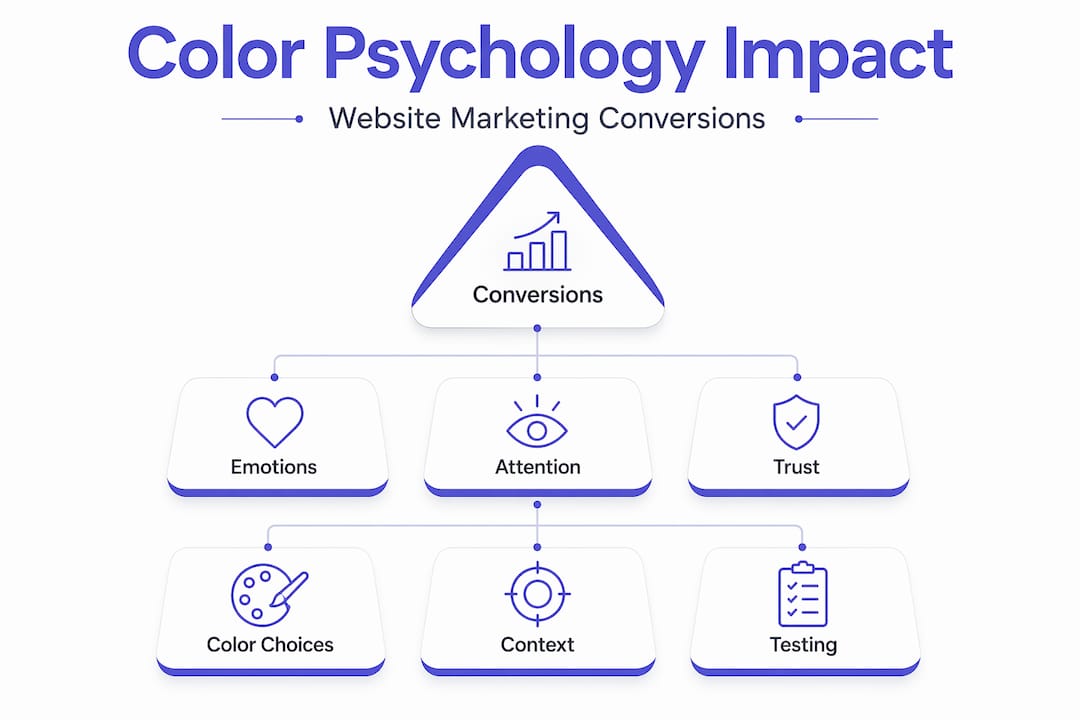
How color affects website engagement and conversions
Here is where the science gets practical. You have probably heard that changing a button color can lift conversions. That is true, but the reason is almost always misunderstood. Button color changes deliver average 2.4% conversion lifts, and contrast impacts results 3.2x more than the specific color chosen. The color itself matters far less than how it stands out from the surrounding design.

This is a critical distinction. A red button on a red background converts terribly. The same red button on a white background converts well, not because red is magic, but because the contrast draws the eye. Green does the same job when the contrast is right.
Key factors that drive color-based conversion changes:
- Contrast ratio between your call-to-action button and its background is the single biggest driver of click-through behavior.
- Brand consistency across your site builds familiarity. Visitors who see your brand colors repeatedly are more likely to convert on return visits.
- Cultural context shapes how colors are perceived. White signals purity in Western markets but is associated with mourning in several East Asian cultures. If you sell internationally, this matters.
- Demographic differences are real. Research shows men tend to prefer bold, saturated colors while women respond more favorably to softer tones, though these are tendencies, not rules.
| Color | Common association (Western markets) | Common association (East Asian markets) |
|---|---|---|
| Red | Urgency, energy, danger | Luck, prosperity, celebration |
| White | Cleanliness, simplicity | Mourning, loss |
| Green | Growth, health, go-ahead | Eco-friendliness, inexperience |
| Blue | Trust, professionalism | Immortality, healing |
| Yellow | Optimism, caution | Royalty, courage |
Pro Tip: Before running a button color A/B test, check your coaching website color optimization against your current background using a contrast checker first. If you are testing a color that already has poor contrast, you are testing the wrong variable.
The conversion rate impact of color is real, but it is context-dependent. The same color can help or hurt depending on your brand, your audience, and what surrounds it on the page.
Nuances and myths about color choices in web design
Let’s address the biggest myth directly: there is no universally “best” color for conversions. The “red button always wins” claim circulated for years based on a single case study taken wildly out of context. In practice, the winning color is almost always the one with the highest contrast against its background in the context of a specific brand and audience.
Color meanings are learned through culture and brand context, not hardwired into human biology. McDonald’s yellow means fast and fun because decades of conditioning made it so. A startup using the same yellow does not automatically inherit those associations.
Here are four principles to guide smarter color decisions:
- Apply the 60-30-10 rule. Use your dominant brand color for 60% of the visual space, a secondary color for 30%, and an accent color for 10%. This creates visual hierarchy without overwhelming visitors. The accent color is typically where your call-to-action lives.
- Test within your actual context. Never copy a competitor’s color palette and expect the same results. Your audience, your copy, and your page layout all change how color performs.
- Account for your audience’s demographics and geography. A color that works brilliantly for a B2B SaaS brand targeting American executives may fall flat for a direct-to-consumer brand targeting young women in Southeast Asia.
- Never sacrifice accessibility for aesthetics. Low-contrast designs that look sleek on a designer’s high-end monitor can be completely unreadable for users with visual impairments or on budget mobile screens.
“Color psychology is not a formula. It is a framework for making informed hypotheses that you then test against real user behavior.” This is the mindset shift that separates marketers who get lasting results from those who chase color trends.
The website pages and color context on your site also matter. Your homepage, service pages, and checkout pages may each benefit from slightly different color emphasis depending on the emotional state you want to create at each stage of the buyer journey.
Practical guide to applying color psychology on your website
Knowing the theory is one thing. Putting it to work on your actual site is another. Here is a clear process you can follow right now.
Step-by-step color audit and implementation:
- Audit your current contrast ratios. Use a free tool like WebAIM’s contrast checker to evaluate every text and button combination on your site. WCAG 2.2 guidelines require a 4.5:1 contrast ratio for normal text and 3:1 for large text and UI components. Most sites fail this test on at least one critical element.
- Map your colors to your buyer journey. Trust-building pages like your About page and testimonials page benefit from cooler, calmer tones. Action-focused pages like landing pages and checkout benefit from warmer, higher-contrast accent colors on CTAs.
- Apply the 60-30-10 hierarchy. Assign your brand’s primary color, secondary color, and accent color to these proportions across every page. Consistency here directly supports brand recognition and return visitor conversion.
- Run A/B tests on high-traffic pages. Focus your first tests on your primary CTA button. Change only the button color, not the copy or layout, so you isolate the variable. Make sure you have enough traffic to reach statistical significance before calling a winner.
- Document everything in a brand style guide. Record exact hex codes, usage rules, and contrast ratios. This prevents color drift as your site grows and ensures every new page maintains visual consistency.
| Color application area | Recommended approach | Why it matters |
|---|---|---|
| CTA buttons | High contrast against background | Drives click-through directly |
| Body text | Dark on light or light on dark (4.5:1+) | Accessibility and readability |
| Hero section | Dominant brand color | Sets emotional tone immediately |
| Trust signals | Cool tones (blue, gray) | Reinforces credibility |
| Urgency elements | Warm tones (red, orange) | Creates action-oriented response |
Pro Tip: Use the tools to boost engagement available on your site alongside color improvements. Color draws attention, but engagement tools keep visitors interacting once they arrive.
Reevaluating color psychology: what marketers often miss
Here is the perspective most color psychology articles will not give you. Color is a multiplier, not a foundation. If your website has weak copy, unclear messaging, or low trust signals, changing your button from green to orange will not save it. Color optimization typically delivers 2-5% conversion lifts after fixing copy and trust signals, and contrast matters more than the color itself.
We have seen business owners spend weeks debating hex codes while their above-the-fold headline fails to communicate a clear value proposition. That is the wrong order of operations. Fix your messaging first. Build social proof. Make your offer obvious. Then test your colors.
The other thing that gets consistently overlooked is accessibility. Roughly 8% of men and 0.5% of women have some form of color vision deficiency. Designing for contrast and readability is not just a compliance checkbox. It is a direct revenue decision. Every visitor who cannot comfortably read your page is a potential customer you are losing.
The most effective approach to color psychology in design is data-driven and contextual. It means forming a hypothesis based on what you know about your audience, testing it against real behavior, and iterating. It does not mean applying a color rule you read in a blog post and assuming it will work universally.
Color is part of a larger effective website design system. When every element, copy, layout, trust signals, and color, works together, that is when you see real, compounding gains in engagement and revenue.
Partner with us to create a color-optimized website that converts
Color psychology is only as powerful as the design system it lives inside. At Cosmic Digital Studios, we build professional websites where color, copy, and conversion strategy work together from the ground up. Every site we create is built with deliberate color hierarchy, accessibility-compliant contrast ratios, and CTA placement designed to guide visitors toward taking action.
Whether you need a full website build or want to improve an existing site’s performance, we bring the same conversion-focused thinking to every project. We also support A/B testing so your color choices are backed by your actual audience data, not assumptions. If you are ready to see what a properly built, coaching or service business website can do for your revenue, let’s talk. You can also explore which pages your site needs to convert visitors into leads.
Frequently asked questions
What is website color psychology?
Website color psychology studies how colors on a website influence visitors’ emotions, perceptions, and decisions, directly affecting engagement and conversions. People form product opinions in 90 seconds with up to 90% of that judgment based on color alone.
Does red always boost conversions on websites?
No. The “red button always wins” myth was debunked in the majority of real-world tests. Contrast between the button and its background consistently matters more than the specific color chosen.
How important is accessibility in website color choices?
Accessibility is essential and directly tied to revenue. WCAG 2.2 requires a 4.5:1 contrast ratio for normal text and 3:1 for large UI components, and most sites currently fail to meet these standards on at least one key element.
What color schemes work best for brand consistency?
The 60-30-10 rule creates visual hierarchy and brand consistency by assigning your dominant, secondary, and accent colors to specific proportions across every page, using exact hex codes throughout.
How can I test if a color choice is effective for my website?
Run A/B tests on your highest-traffic pages, changing only the color variable while keeping copy and layout identical. Test with at least 10,000 sessions per variant after you have already addressed your copy and trust signals for meaningful results.