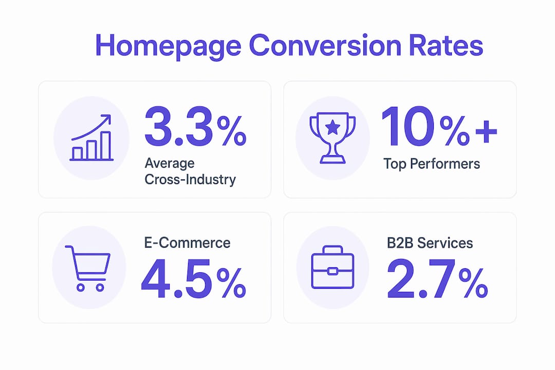
A high-converting homepage is a strategically designed webpage that guides visitors toward a specific action, whether that’s booking a call, making a purchase, or submitting a lead form, with measurable results. The average website conversion rate sits at 3.3% across industries in 2026, while top-performing sites consistently hit 10% or higher. That gap is not luck. It is the direct result of deliberate design decisions, clear messaging, and a deep understanding of what visitors need to see before they act. Tools like Google Analytics, Hotjar, and Ryze.ai exist precisely to help you close that gap.
What is a high converting homepage and why does it matter?
A high-converting homepage is defined by one thing: it turns visitors into leads or customers at a measurably higher rate than the industry average. Conversion rate optimization (CRO) is the recognized industry term for the discipline behind building and refining these pages. Understanding both terms matters because CRO is the process, and a high-converting homepage is the outcome.
Your homepage is the most visited page on your site. It is often the first and only chance you get to communicate your value, establish credibility, and direct someone toward a decision. A homepage that fails to do this clearly does not just lose a visitor. It wastes every dollar you spent getting that person there in the first place.

The business case is direct. Raising conversion from 2% to 3% generates 50% more revenue from the exact same traffic volume, with zero increase in ad spend. For most businesses, that single improvement is worth more than doubling their paid traffic budget. This is why CRO-focused design is not optional for serious marketers in 2026.
What are the essential elements of a high-converting homepage?
Every high-converting website shares a core set of structural and content elements. These are not design preferences. They are conversion levers with documented impact on user behavior.
- Clear value proposition above the fold. Visitors decide within seconds whether to stay or leave. Your headline must communicate exactly what you do, who you do it for, and why it matters. Vague taglines kill conversions.
- CTA placement above the fold. Strategic CTA positioning above the fold, with simple, direct phrasing, consistently outperforms CTAs buried lower on the page. “Book a Free Call” beats “Learn More” every time.
- Verified social proof near the top. Displaying verified reviews and testimonials prominently increases conversions by up to 25%. This is not decoration. It is trust infrastructure.
- Intuitive navigation. Visitors should never have to think about where to go next. Limit your main navigation to five items or fewer and remove anything that does not serve the conversion goal.
- Fast load speed and mobile responsiveness. A page that loads slowly or breaks on mobile loses conversions before a single word is read. Google’s Core Web Vitals directly connect page speed to both rankings and user retention.
- Persuasive copy and strategic visuals. Focused messaging with reduced friction is a core pillar of high-converting pages. Every image and every sentence should support the action you want visitors to take.
- Reduced cognitive load. Fewer choices, shorter forms, and cleaner layouts all lower the mental effort required to convert. When you make it easy to act, more people act.
Pro Tip: Run your homepage through Google’s PageSpeed Insights and Hotjar’s heatmap tool before making any copy or design changes. Data on where visitors drop off tells you exactly where to focus first.
Understanding website color psychology is also worth your attention. Color choices affect trust, urgency, and click behavior in ways most homepage owners underestimate.
How do homepage conversion rates compare across industries?
Context matters when you are evaluating your own homepage performance. Not all industries convert at the same rate, and knowing where you stand shapes how aggressively you should prioritize CRO.
| Industry | Typical Conversion Rate | Top Performers |
|---|---|---|
| E-commerce | 2.5% to 4.2% | 8% to 10%+ |
| SaaS and software | 3% to 5% | 10%+ |
| Professional services | 3% to 6% | 10%+ |
| Cross-industry average | 3.3% | 10%+ |
The cross-industry average of 3.3% means that most homepages are converting fewer than 4 out of every 100 visitors. Top performers are converting three times that number from the same traffic. The difference is almost entirely attributable to design, messaging, and trust signals, not traffic quality.
“CRO experts advise focusing on extracting more value from current visitors instead of just increasing traffic. Even a 1% uplift doubles leads without extra ad spend.” — HubSpot CRO Strategy Guide
This reframes the entire conversation about marketing ROI. Conversion optimization lowers acquisition costs and improves ad platform performance because platforms like Google Ads and Meta reward higher-converting destinations with lower cost-per-click. Optimizing your homepage is not just a revenue play. It is a cost-reduction strategy.
What strategies and testing methods improve homepage conversions?
Effective homepage design is not a one-time project. It is a continuous CRO process built on testing, data, and iteration. Here is how to approach it systematically.
- Audit your current performance. Use Google Analytics to identify your homepage bounce rate, average session duration, and conversion events. Hotjar adds behavioral data through heatmaps and session recordings, showing exactly where visitors lose interest.
- Prioritize high-impact elements first. Headlines, CTAs, and hero images drive the most conversion variance. Start testing these before touching secondary elements like footer copy or sidebar content.
- Run A/B tests on one variable at a time. Testing headlines and imagery regularly optimizes engagement and conversions. Changing multiple elements simultaneously makes it impossible to know what actually moved the needle.
- Use multivariate testing for advanced optimization. Once you have a baseline from A/B tests, multivariate testing lets you evaluate combinations of elements, such as headline plus CTA color plus hero image, to find the highest-performing configuration.
- Act on statistical significance, not gut feel. A test result is only meaningful when it reaches statistical significance, typically 95% confidence. Tools like Google Optimize and VWO calculate this automatically.
- Avoid dark patterns. True CRO builds trust and simplifies buying. Tactics like fake countdown timers, hidden fees, or forced opt-ins generate short-term conversions and long-term brand damage.
Pro Tip: If you are just starting with CRO, focus your first 90 days on your headline, your primary CTA, and your social proof placement. These three elements account for the majority of conversion variance on most homepages.
Learning how to turn visitors into clients requires treating your homepage as a living document, not a finished product. The best-performing sites test continuously.
How to design your homepage to build trust and reduce friction
Trust and friction are the two forces that determine whether a visitor converts or leaves. Effective homepage design manages both deliberately.
Trust-building elements that work:
- Verified customer reviews and star ratings placed near the top of the page
- Client logos and recognizable brand associations
- Press mentions and media coverage (even a single credible mention adds authority)
- Clear privacy statements near forms and opt-ins
- Professional photography and consistent visual branding
85% of consumers rely on reviews when making purchase decisions. Placing that social proof prominently is not just good practice. It directly addresses the primary reason most visitors hesitate to act.
Friction reduction tactics that convert:
| High Friction | Low Friction Alternative |
|---|---|
| Long multi-field forms | Single-field email capture or one-click booking |
| Confusing navigation menus | Five items or fewer with clear labels |
| Slow-loading hero images | Compressed WebP images with lazy loading |
| Generic stock photography | Real team photos or product-in-use images |
| Vague CTAs like “Submit” | Specific CTAs like “Get My Free Audit” |
Cognitive ease is the underlying principle here. When visitors do not have to work hard to understand your offer or take action, conversion rates rise. Every element of your homepage should reduce the mental effort required to say yes. This is why strong CTAs with specific, benefit-driven language consistently outperform generic button text.
Common homepage mistakes that destroy trust include cluttered layouts with too many competing messages, mismatched visual styles that signal a lack of professionalism, and navigation structures that send visitors away from the conversion path. If your homepage has more than two primary calls to action, you are splitting attention and reducing the likelihood that visitors take any action at all.
Key takeaways
A high-converting homepage requires a clear value proposition, verified social proof, a strategic CTA above the fold, and continuous testing to outperform the 3.3% industry average.
| Point | Details |
|---|---|
| Define your conversion goal | Every homepage element should serve one primary action, whether that is a booking, purchase, or sign-up. |
| Social proof drives trust | Verified reviews placed near the top of the page increase conversions by up to 25%. |
| CRO beats more traffic | Raising conversion from 2% to 3% generates 50% more revenue without additional ad spend. |
| Test before you redesign | Use Google Analytics and Hotjar to identify drop-off points before making design changes. |
| Reduce friction everywhere | Simpler forms, clearer CTAs, and faster load times lower the effort required to convert. |
What I have learned from building conversion-focused homepages
After working on dozens of homepage builds and redesigns, the pattern I see most often is this: business owners invest heavily in driving traffic and almost nothing in understanding why that traffic is not converting. They assume the problem is volume. The real problem is almost always clarity.
The homepages that convert best are not the most visually impressive ones. They are the ones where a visitor can answer three questions within five seconds: What is this? Who is it for? What do I do next? When those answers are obvious, conversion rates climb. When they are buried under clever copy or complex layouts, even well-targeted traffic bounces.
One thing I push back on consistently is the idea that more content equals more trust. Long homepages with extensive feature lists, multiple testimonial carousels, and detailed FAQ sections often perform worse than focused, concise pages with a single strong CTA. Visitors are not reading your homepage. They are scanning it for a reason to stay or leave.
The other mistake I see regularly is treating a homepage launch as a finish line. The sites that consistently build coaching websites that convert or generate leads at scale are the ones where the owner treats the homepage as a hypothesis to be tested, not a design to be admired. Digital behavior shifts. What worked in 2023 may not work in 2026. Build in a testing cadence from day one.
— Max
How Cosmicdigitalstudios builds homepages that convert
If your homepage is not generating the leads or sales your business needs, the problem is almost always fixable with the right design and messaging strategy.
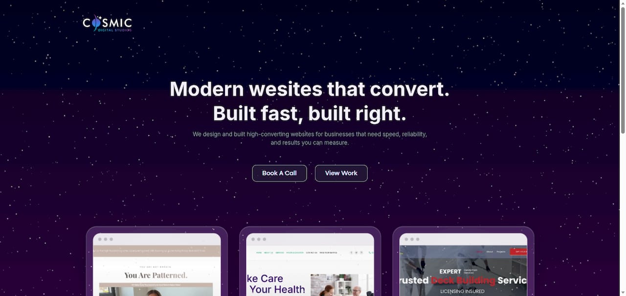
Cosmicdigitalstudios builds custom websites and conversion-focused funnels designed to turn visitors into booked calls, leads, and sales. Every build is grounded in CRO principles, from value proposition clarity to CTA placement and social proof structure. Whether you need a full website redesign or a new homepage built from scratch, the work is tailored to your business goals and your audience. Visit Cosmicdigitalstudios to see what a conversion-optimized homepage looks like in practice.
FAQ
What is a high converting homepage?
A high-converting homepage is a webpage designed to guide visitors toward a specific action, such as a purchase or lead form submission, at a measurably higher rate than average. Top-performing homepages achieve conversion rates of 10% or higher compared to the 3.3% cross-industry average.
What conversion rate should my homepage aim for?
The cross-industry average homepage conversion rate is 3.3% in 2026, with top performers exceeding 10%. For e-commerce sites, a realistic target range is 2.5% to 4.2%, with strong optimization pushing above that.
How does social proof affect homepage conversions?
Verified reviews and testimonials placed near the top of a homepage increase conversions by up to 25%, because 85% of consumers rely on reviews before making purchase decisions.
What is the fastest way to improve homepage conversion rates?
Start by auditing your headline, CTA placement, and social proof using tools like Google Analytics and Hotjar. A/B testing these three elements first delivers the highest conversion impact for the least effort.
Is it better to increase traffic or improve conversions?
Improving conversions delivers better ROI than increasing traffic. Raising your conversion rate from 2% to 3% generates 50% more revenue from the same visitor volume, with no additional acquisition cost.