
Mobile responsive design is defined as the practice of building websites that automatically adjust their layout, content, and visuals based on the screen size and resolution of the user’s device. The industry term is responsive web design (RWD), coined by Ethan Marcotte in 2010 and now the standard approach across professional web development. Whether your visitors arrive on a 6-inch smartphone or a 27-inch desktop monitor, a responsive site delivers a clean, functional experience without requiring a separate mobile version. According to MDN, responsive web design is not a single technology but a set of best practices combining flexible grids, responsive images, and CSS media queries. For web designers, developers, and business owners, understanding this distinction is the foundation of every smart build decision you will make in 2026.
What is mobile responsive design and how does it work technically?
Responsive web design operates through three coordinated mechanisms: flexible grid layouts, CSS media queries, and responsive images. These three components work together, not independently. MDN advises combining all three rather than relying on any single technique, because a site with fluid grids but fixed images will still break on mobile.
Here is how each mechanism functions in practice:
-
Flexible grids and layouts. Instead of fixed pixel widths, columns and containers are sized using relative units like percentages or the CSS "fr
unit. A two-column layout set to50% / 50%` will scale proportionally on any screen rather than overflowing on small devices. -
CSS media queries. These are conditional rules that apply different styles at specific screen widths, called breakpoints. A common breakpoint targets screens below 768px for tablet layouts and below 480px for phones. Media queries do not replace your base styles; they layer on top of them.
-
Responsive images. Images declared with
max-width: 100%in CSS scale down within their containers. The HTMLsrcsetattribute takes this further by serving different image files based on screen resolution, which reduces load times on mobile. -
The viewport meta tag. This is the most overlooked element in responsive design. Without it, mobile browsers default to a 980px virtual width, which causes your carefully written CSS breakpoints to fire at the wrong sizes. Every HTML document must include
<meta name="viewport" content="width=device-width, initial-scale=1">in the<head>. -
Mobile-first CSS. The mobile-first approach starts by writing base styles for the smallest screen and then uses
min-widthmedia queries to progressively enhance the layout for larger viewports. This forces you to prioritize content and performance from the start.
Pro Tip: If your responsive breakpoints are not behaving as expected on a real device, check the viewport meta tag first. It is the single most common reason a technically correct CSS file fails on mobile.
Responsive design vs. mobile-first vs. mobile-friendly: what’s the difference?

These terms are used interchangeably in most conversations, but they describe distinct concepts. Confusing them leads to poor build decisions.
| Concept | Definition | Key characteristic |
|---|---|---|
| Responsive web design | One site adapts to any screen size via flexible layouts and media queries | Device-agnostic, scales in both directions |
| Mobile-first design | Design and CSS start from the smallest screen and scale up | Prioritizes small-screen UX before desktop |
| Mobile-friendly | Site is usable on mobile but not necessarily fluid or optimized | Minimum standard, often a fixed narrow layout |
| Mobile-optimized | A separate site or experience built specifically for mobile users | Requires maintaining two codebases |
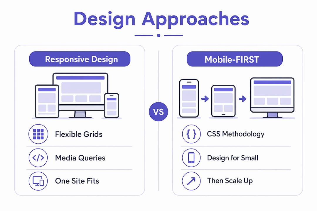
Responsive design and mobile-first are complementary, not competing. You can build a responsive site without using the mobile-first CSS methodology, but IxDF highlights that mobile-first forces prioritization of essential content and delivers better UX on small devices. Most professional teams now treat mobile-first as the default starting point within a responsive build.
Mobile-friendly is the floor, not the ceiling. Google’s mobile-friendly test will pass a site that simply avoids tiny text and overlapping elements. That does not mean the site performs well or converts visitors. Mobile-optimized, on the other hand, means maintaining a separate m.yoursite.com subdomain or a dedicated mobile codebase. Coursera describes how this approach increases maintenance burden and creates content mismatch risks when updates are applied to one version but not the other. For most businesses, responsive design is the correct choice.
Why is mobile responsiveness important for your business?
Responsive web design directly affects revenue, search rankings, and operational costs. These are not abstract benefits.
- User experience across every device. A site that breaks on mobile loses visitors immediately. Mobile site speed and layout quality are the two fastest ways to lose or keep a visitor’s attention on a small screen.
- SEO performance. Search engines favor mobile-friendly, fast sites in their rankings. Google uses mobile-first indexing, meaning it crawls and ranks the mobile version of your site first. A non-responsive site is penalized in organic search before a user ever sees it.
- Reduced maintenance costs. A single responsive codebase means one set of content, one set of updates, and one QA process. Coursera confirms that maintaining separate desktop and mobile versions increases the risk of outdated or inconsistent content. That risk compounds over time.
- Accessibility and usability. Responsive design supports users with varying devices, connection speeds, and accessibility needs. Fluid layouts adapt to zoom levels and assistive technologies more reliably than fixed-width designs.
- Conversion rates. A visitor who can read your offer, click your button, and fill out your form on a phone is far more likely to convert. Understanding how visitors become clients starts with making sure the experience works on the device they are actually using.
“Responsive design is not a feature you add to a website. It is the baseline expectation every visitor brings to your site before they read a single word.”
Mobile marketing strategies depend entirely on this foundation. Without a responsive site, mobile marketing for small businesses produces traffic that bounces before it converts.
How to create a responsive site: best practices and common pitfalls
Building a responsive website correctly requires a coordinated approach across HTML, CSS, and your media assets. Treating it as a CSS-only problem is the most common mistake teams make.
Start with structure, not styles. Write clean, semantic HTML before touching a single media query. A well-structured document adapts more predictably because the content hierarchy is already logical. Retrofitting responsiveness onto a poorly structured HTML document produces fragile results.
Use fluid grids and flexible images consistently. Set container widths in percentages or use CSS Grid and Flexbox with relative units. Apply max-width: 100%; height: auto; to all images as a baseline rule. Scrimba’s 2026 guide notes that modern responsive design now incorporates container queries and fluid typography alongside traditional media queries, giving you finer control over component-level responsiveness rather than just page-level breakpoints.
Common pitfalls to avoid:
- Forgetting the viewport meta tag. Without it, media queries fire at the wrong sizes on every mobile device.
- Using
pxfor font sizes instead ofremorem, which prevents text from scaling with user preferences. - Testing only in browser DevTools. Real devices behave differently. Test on actual phones and tablets before launch.
- Treating responsive design as a final step. Build responsively from day one, not as a retrofit after desktop design is complete.
- Ignoring touch targets. Buttons and links need a minimum tap area of 44×44 pixels on mobile to meet usability standards set by Apple’s Human Interface Guidelines and Google’s Material Design.
Pro Tip: Use the website redesign checklist from Cosmicdigitalstudios to audit your current site’s responsiveness before starting a rebuild. It covers viewport settings, image optimization, and layout structure in one place.
Container queries, introduced in modern CSS, let individual components respond to the size of their parent container rather than the full viewport. This is a significant improvement for reusable UI components like cards, sidebars, and modals. Fluid typography, using CSS clamp(), sets font sizes that scale smoothly between a minimum and maximum value without needing separate breakpoints for each size. Both techniques represent where responsive design is heading in 2026.
Key takeaways
Responsive web design is the non-negotiable baseline for any website that needs to perform across devices, rank in search, and convert visitors into leads or customers.
| Point | Details |
|---|---|
| Core definition | Responsive web design uses flexible grids, media queries, and responsive images to adapt one site to any screen. |
| Viewport meta tag | Missing this tag breaks all CSS breakpoints on mobile; include it in every HTML document without exception. |
| Mobile-first approach | Writing CSS from the smallest screen up forces better content prioritization and improves performance. |
| Business impact | A single responsive codebase reduces maintenance costs, improves SEO, and increases conversion rates. |
| Modern techniques | Container queries and fluid typography extend responsiveness beyond simple breakpoints for component-level control. |
Why responsive design still wins, even in 2026
I have reviewed hundreds of websites for businesses ranging from solo service providers to mid-size e-commerce brands. The single most consistent finding is this: teams that treat responsive design as a checkbox item produce sites that technically pass Google’s mobile test but fail real users within seconds.
The mistake I see most often is building the desktop version first and then squeezing it into a mobile layout afterward. That approach produces compromises at every breakpoint. The navigation becomes a collapsed menu that nobody opens. The hero section becomes a cropped image with text nobody reads. The form fields become too small to tap without zooming. None of these are CSS problems. They are design and strategy problems that CSS cannot fix after the fact.
Mobile-first is not just a technical methodology. It is a discipline that forces you to answer a harder question: what does this visitor actually need on a small screen, with limited time and attention? When you answer that question first, the desktop version almost always becomes cleaner and more focused too.
The teams I have seen execute this best treat the mobile layout as the primary design artifact and the desktop layout as the enhanced version. That mental shift changes everything from the navigation structure to the call-to-action placement. If you are planning a new build or a redesign in 2026, start there.
— Max
Build a responsive website that actually converts
If your current site is not performing on mobile, the problem is rarely just layout. It is usually a combination of slow load times, poor structure, and a design that was never built with mobile users in mind.
Cosmicdigitalstudios builds fast, modern websites designed to work on every device and guide visitors toward taking action. Every build starts with mobile-first principles, clean HTML structure, and conversion-focused design. If you are ready to stop losing mobile visitors and start turning them into leads, explore what a professional website redesign looks like when it is done right.
FAQ
What is responsive web design in simple terms?
Responsive web design is an approach where one website automatically adjusts its layout and content to fit any screen size, from phones to desktops, using flexible grids, CSS media queries, and scalable images.
Why does my responsive site not work correctly on mobile?
The most common cause is a missing or incorrect viewport meta tag. Without this tag, mobile browsers default to a 980px virtual width, which causes CSS breakpoints to fire at the wrong sizes.
What is the difference between mobile-first and responsive design?
Responsive design describes the overall approach of building one adaptive site. Mobile-first is a specific CSS methodology within that approach where styles are written for small screens first and enhanced for larger screens using min-width media queries.
Does responsive design improve SEO?
Yes. Google uses mobile-first indexing, meaning it ranks the mobile version of your site first. A responsive site that loads fast and functions well on mobile directly improves search rankings compared to a non-responsive or slow-loading site.
What are container queries and do I need them?
Container queries are a modern CSS feature that lets components respond to the size of their parent element rather than the full viewport. They are useful for reusable components like cards and sidebars, and Scrimba’s 2026 guide identifies them as a key part of modern responsive design alongside fluid typography.