
Your homepage is a lead-generation funnel, not a digital brochure. Every section must earn its place by moving a visitor closer to contacting you. This local business homepage section checklist gives you a clear, section-by-section framework built on conversion principles used by professional web designers. Visitors decide to stay or leave within 3–5 seconds of landing on your page. That means your hero section, your headline, and your primary call-to-action must do the heavy lifting before the visitor ever scrolls.
1. Local business homepage section checklist: start with the hero section
The hero section is the single most important part of your homepage. It sits above the fold and answers three questions instantly: what you do, who you serve, and where you operate. If a visitor cannot answer those three questions in under five seconds, they leave.
Your hero headline should name your service and your location. “Trusted Plumber in Austin, TX” outperforms “Welcome to Our Website” every time. Follow that with a one-sentence subheadline that adds a trust signal or a differentiator, such as “Licensed, insured, and available same-day.” Then place a single, high-contrast CTA button. “Get a Free Quote” or “Book a Call Today” are proven formats for local service businesses.

Pro Tip: Avoid putting your business name as the hero headline. Your name means nothing to a first-time visitor. Your service and location mean everything.
2. Services overview section
Your services section should present 3–6 core offerings as short, linked service cards rather than long paragraphs. Each card gets a title, a one-sentence description, and a link to a dedicated service page. This keeps your homepage focused while giving interested visitors a clear path to learn more.
Long service descriptions on the homepage kill conversions. Visitors scan, they do not read. A card format respects that behavior. It also signals to search engines that your site covers specific, relevant topics, which supports your local SEO.
Keep each card description under 20 words. If you cannot describe a service in one sentence, the description is too complicated for a homepage.
3. Social proof section
88% of consumers trust online reviews as much as personal recommendations. That statistic means your homepage must display real reviews, not just a star rating buried in the footer. Embed Google review snippets, display a star average with a review count, or feature two to three short testimonials with the reviewer’s name and location.
Social proof works best when it is specific. “Great service!” is weak. “Fixed our AC in 90 minutes on a Saturday. Will call again.” is credible. Curate your strongest reviews and place them in a dedicated section between your services and your about section.
Trust badges also belong here. BBB accreditation, Google Guaranteed status, and industry certifications all reduce hesitation. Place them visually near your reviews for maximum effect.
4. About or team section
The about section humanizes your business. Visitors want to know who they are hiring before they call. A photo of you or your team, two to three sentences about your background, and a mention of how long you have served the local area builds immediate credibility.
Skip the corporate biography format. Write in plain language. “We’ve served Dallas homeowners since 2011” is more persuasive than “Our organization was founded with a mission to deliver excellence.” Specificity builds trust. Vague language erodes it.
If you have a small team, show their faces. A named, photographed team signals that real people stand behind the work.
5. Service area map or coverage section
A visual service area map tells visitors immediately whether you serve their neighborhood. This is a local SEO homepage tip that most small business owners skip, and it costs them leads. A simple embedded Google Map or a list of served cities and zip codes does the job.
This section also reinforces your local relevance to search engines. When your homepage explicitly names the cities and regions you serve, Google has stronger signals to rank you for location-based searches. Place this section after your about section and before your FAQ.
Pro Tip: List your top 5–10 service cities as text below the map. Search engines read text, not map images. Both elements together give you the best local SEO result.
6. FAQ section
A homepage FAQ reduces friction before a visitor ever contacts you. Answer the three to five questions your customers ask most often before booking. Common examples include pricing ranges, response times, licensing, and what to expect on a first visit.
Keep each answer to two to three sentences. The goal is to remove doubt, not to provide a full explanation. If a question requires a long answer, link to a dedicated FAQ page or a blog post. The homepage FAQ is a conversion tool, not a knowledge base.
7. Contact section and footer
Your contact information must be immediately accessible on every page, but especially on the homepage. The contact section should include your phone number as a clickable link, your business hours, your physical address if applicable, and a short contact form.
The footer reinforces this information. Include your NAP (name, address, phone number) in the footer on every page. Consistent NAP data across your website and your Google Business Profile is a foundational local SEO requirement. Inconsistency confuses both visitors and search engines.
Place a secondary CTA in the contact section. Visitors who scroll to the bottom are highly interested. Give them a clear next step, such as “Call us now” or “Send a message.”
8. How to write headlines and CTAs that convert
Headline clarity is the fastest way to improve your homepage without redesigning it. Your primary headline should focus on the customer’s outcome, not your company’s identity. “Get Your Roof Fixed Fast in Phoenix” converts better than “Phoenix’s Premier Roofing Company.”
Effective CTAs for local businesses follow a simple pattern: action verb plus specific outcome. Here are formats that work:
- “Get a Free Estimate”
- “Book Your Appointment”
- “Call Us Now: [Phone Number]”
- “See If We Serve Your Area”
One primary CTA per section is the rule. Multiple CTAs create decision paralysis and reduce conversion rates. Pick the one action you most want visitors to take in each section, and remove everything else competing with it.
Pro Tip: On mobile, your CTA button needs to be at least 44px tall and easy to tap with a thumb. Small buttons cost you calls.
Mobile-first design is not optional. Over 60% of visitors access local business websites from their phones. Every button, headline, and section must be tested on a phone screen before you publish.
9. Common homepage mistakes that reduce conversions
Most local business homepages fail for the same predictable reasons. Recognizing these patterns lets you fix them before they cost you leads.
- Too many CTAs. When every section has three buttons, visitors freeze. One CTA per section, always.
- Rotating carousels or sliders. Sliders reduce engagement and confuse visitors. Use a single, static hero image instead.
- No mobile optimization. A homepage that looks great on desktop but breaks on a phone loses more than half your potential leads.
- Vague service descriptions. “We do it all” tells visitors nothing. Name your specific services with clear language.
- Missing social proof. A homepage without reviews or ratings asks visitors to trust you blindly. That is a high bar for a first-time visitor.
- Slow load speed. A page that takes more than three seconds to load sees a sharp drop in visitor retention. Fast-loading pages directly support both conversions and local search rankings.
10. How to prioritize content and structure for maximum impact
Content hierarchy determines whether visitors find what they need or give up. The proven section order for a local business homepage is: hero, services, social proof, about/team, service area, FAQ, and contact/footer. Each section builds on the last, moving the visitor from awareness to trust to action.
Limit your homepage to two to three screens of scroll on mobile. More content dilutes focus and reduces the likelihood of conversion. If you have more to say, link to interior pages. The homepage is the entry point, not the destination.
Use a comparison of content approaches to decide what belongs on your homepage versus a dedicated page:
| Content type | Homepage | Dedicated page |
|---|---|---|
| Service summary (1 sentence) | Yes | No |
| Full service description | No | Yes |
| 2–3 featured reviews | Yes | No |
| Full review archive | No | Yes |
| Business overview (2–3 sentences) | Yes | No |
| Full team bios | No | Yes |
| Top 3 FAQ answers | Yes | No |
| Complete FAQ | No | Yes |
Pro Tip: Use Google Analytics or Microsoft Clarity to track where visitors drop off on your homepage. If most people leave before reaching your contact section, your hero or services section needs work.
Key takeaways
A high-converting local business homepage follows a clear section order, limits content to what drives action, and places social proof and a single CTA in every key section.
| Point | Details |
|---|---|
| Hero section is critical | State your service, location, and CTA above the fold within the first five seconds. |
| Limit services to 3–6 cards | Use short linked cards, not long descriptions, to keep visitors moving toward a call. |
| Social proof drives trust | Embed real reviews with names and locations; 88% of consumers trust them like referrals. |
| One CTA per section | Multiple CTAs cause hesitation; pick one action per section and remove the rest. |
| Mobile and speed are non-negotiable | Over 60% of visitors use phones; slow or broken mobile pages lose leads immediately. |
What I’ve learned from building local business homepages
Most small business owners treat their homepage like a company brochure. They list every service, write long paragraphs about their history, and add five different buttons hoping something sticks. That approach does not convert. It confuses.
The homepages that actually generate calls share one trait: they are built around a single conversion goal. Every section exists to move the visitor one step closer to that goal. The hero answers “why you.” The services section answers “what you do.” The reviews answer “can I trust you.” The contact section answers “how do I reach you.” Nothing else belongs on the page.
I’ve also seen business owners invest in beautiful design while ignoring messaging. A stunning homepage with a vague headline still fails. The words do more work than the visuals. Get the headline right first, then worry about the aesthetics.
The homepage layout for small business that converts is not complicated. It is disciplined. It says no to everything that does not serve the visitor’s decision to contact you. That discipline is harder than it sounds, but it is the difference between a homepage that gets traffic and one that gets leads.
— Max
Your homepage, built to convert
If your current homepage is not generating consistent leads, the structure is likely the problem, not the traffic.
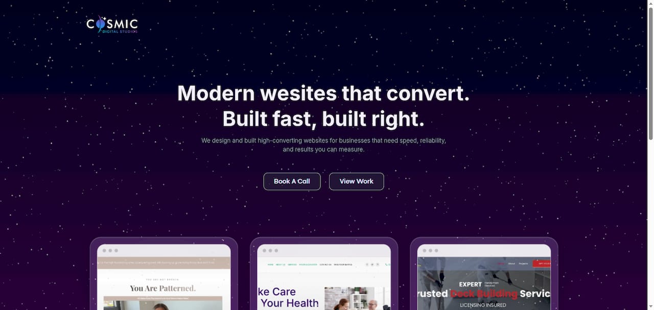
Cosmicdigitalstudios builds custom websites for local businesses that are fast, clear, and designed to turn visitors into booked calls. Every homepage we build follows a conversion-focused structure: a strong hero, focused service cards, embedded social proof, and a contact section that makes it easy to reach you. If you are ready to build a homepage that works, or if your current site needs a full overhaul, our website redesign process is built around your specific business goals. Clean design. Strong messaging. Real results.
FAQ
What sections does a local business homepage need?
A local business homepage needs a hero, services overview, social proof, about section, service area, FAQ, and contact/footer. Each section serves a specific role in moving visitors toward contacting you.
How long should a local business homepage be?
Conversion specialists recommend limiting your homepage to two to three screens of scroll on mobile. More content dilutes focus and reduces the chance a visitor takes action.
How many CTAs should a homepage have?
Use one primary CTA per section. Multiple CTAs create decision paralysis and lower conversion rates. Pick the single most important action for each section and remove competing buttons.
Why does social proof matter on a homepage?
88% of consumers trust online reviews as much as personal recommendations. Displaying real reviews with names and locations on your homepage builds credibility before a visitor ever contacts you.
What is the biggest homepage mistake local businesses make?
The most common mistake is treating the homepage as an information dump rather than a lead funnel. Overloading visitors with content, multiple CTAs, and vague service descriptions reduces conversions significantly.