
High-converting plumber homepages share the same structural DNA: a clear above-the-fold headline, a single primary CTA (tap-to-call or book online), visible trust signals, a short services list, and mobile-first performance. These elements work together because they match how a stressed homeowner actually behaves — they land on your page with a problem, scan for a phone number or a booking button, and leave within seconds if they can’t find either. Here’s your quick-reference checklist before we go deeper:
- Clear headline stating what you do and where you serve
- Tap-to-call phone number in the fixed header and hero
- Single primary CTA above the fold (call or book)
- Short services list with links to individual service pages
- Trust signals above the fold: reviews, badges, years in business
- Before/after photos or project gallery (lazy-loaded)
- Service area map or coverage list
- Emergency/24-7 badge if applicable
Table of Contents
- What do the best examples of plumber website homepages have in common?
- What conversion and mobile-first practices actually move the needle?
- How should coaches and consultants adapt these plumber homepage patterns?
- A copy-paste homepage template you can hand to your designer
- Does your homepage work for every visitor?
- What visual design choices work best for plumber websites?
- Which homepage sections do visitors actually look for?
- Key Takeaways
- What the plumber homepage patterns reveal about every service business
- Your homepage, built to convert — not just look good
- Research sources and further reading
What do the best examples of plumber website homepages have in common?
The strongest plumbing service homepage examples follow a consistent pattern: clear hero headlines, trust signals, and CTAs placed above the fold so visitors convert before they scroll. Five distinct layout patterns cover nearly every business priority a plumber faces.
Pattern 1: Emergency-first
Who it fits: Plumbers whose primary revenue comes from urgent calls — burst pipes, gas leaks, weekend floods.

Above the fold: Bold headline (“24/7 Emergency Plumber in [City]”), a red or high-contrast tap-to-call button, and an emergency badge. No distractions.
Three must-haves: Fixed-header phone number, emergency availability statement, and a single-sentence value prop (“We arrive in 60 minutes or less”).
Messaging note: Urgency is the entire pitch. Keep copy short and direct. Avoid listing every service in the hero.
Pattern 2: Appointments-first
Who it fits: Residential plumbers focused on scheduled maintenance, installs, and remodels.
Above the fold: Friendly headline (“Book a Plumber Online — Same-Day Slots Available”), an inline booking widget, and a secondary tap-to-call link.
Three must-haves: Embedded scheduler, service dropdown in the booking form, and a trust line (“Trusted by many homeowners in [City]”).
Messaging note: Adding online booking to your homepage removes the friction that kills conversions for appointment-driven businesses.
Pattern 3: Reviews-led
Who it fits: Established plumbers competing on reputation in a crowded local market.
Above the fold: Headline anchored to social proof (“Seattle’s Highest-Rated Plumber with multiple 5-Star Reviews”), star-rating badge, and a tap-to-call CTA.
Three must-haves: Google review widget or star count in the hero, a short testimonial strip below the fold, and a “Voted Best” trust line.
Messaging note: Place the review count in the headline itself, not buried in a footer widget. That’s where it earns its conversion value.
Pattern 4: Portfolio-led
Who it fits: Plumbers targeting commercial clients or high-end residential remodels where visual proof closes the sale.
Above the fold: Full-width before/after photo or project image, headline focused on quality (“Custom Plumbing for Kitchens, Baths & Commercial Builds”), and a “View Our Work” CTA alongside tap-to-call.
Three must-haves: Optimized before/after photo gallery, project category links, and a short credentials strip (licensed, insured, years in business).
Messaging note: Lazy-load gallery images and link thumbnails to a full gallery page so the homepage stays fast.
Pattern 5: Simple booking micro-site
Who it fits: Solo plumbers or new businesses that need a fast, low-cost web presence.
Above the fold: One-screen layout — name, service area, phone number, and a single booking button. Nothing else.
Three must-haves: NAP (name, address, phone) in the header, one clear CTA, and a short “About” blurb with a license number.
Messaging note: Simplicity is a feature here. A one-page site that loads in under two seconds beats a bloated five-page site every time.
The most common homepage mistake isn’t missing a feature — it’s having too many equal-weight CTAs. Pick one primary conversion path (call or book), build the hero around it, and treat everything else as secondary. Simpro’s plumbing website research confirms that a clear CTA hierarchy converts faster than pages where every button competes for attention.
Pro Tip: Use before/after photos when your work is visually dramatic (remodels, pipe replacements). Use testimonial headshots when your differentiator is trust and relationship — a smiling customer photo outperforms a pipe photo for reputation-driven businesses.
What conversion and mobile-first practices actually move the needle?
Mobile traffic dominates local service searches, which means your homepage must load fast, display cleanly on a 375px screen, and put the phone number one tap away. These are the rules that directly affect booked calls.
Place a tap-to-call button in the fixed header and repeat it in the hero CTA. A visitor who can’t find your number in three seconds will call your competitor. Below the hero, add a secondary inline booking widget for desktop users who prefer scheduling over calling. Live chat widgets serve a third segment — younger customers and those comparing multiple plumbers who want answers before committing to a call. Tools like ChatzyBot handle after-hours inquiries automatically, keeping leads warm overnight.
Fast-loading local websites directly affect both rankings and conversions. Lazy-load gallery images, use WebP format where supported, and show 1–3 optimized thumbnails above the fold that link to a full gallery page loading progressively. For local SEO, include your NAP in the footer and add LocalBusiness schema markup so Google can surface your hours, phone, and service area in search results. NAP consistency across your site and directory listings reinforces your local ranking signals.
| Homepage element | Mobile priority | Placement |
|---|---|---|
| Tap-to-call button | Critical | Fixed header + hero |
| Primary CTA (book/call) | Critical | Above the fold |
| Services list | High | Below hero |
| Reviews / star rating | High | Hero or first scroll |
| Emergency/24-7 badge | High (if applicable) | Hero |
| Live chat widget | Medium | Fixed corner |
| Before/after gallery | Medium | Mid-page, lazy-loaded |
| Service area map | Medium | Mid-page |
| LocalBusiness schema | High (SEO) | Page source |
Pro Tip: Keep your homepage lightweight for fast loading. A website launch checklist that includes a Lighthouse performance audit before go-live will catch gallery images and unoptimized scripts before they cost you rankings.
How should coaches and consultants adapt these plumber homepage patterns?
The structural logic behind plumber homepage patterns maps directly onto other local service businesses. The emergency-first pattern works for any urgent, appointment-driven service: a therapist offering same-day crisis sessions, a consultant with a “free 30-minute audit” hook, or a fitness coach running limited-enrollment programs. The reviews-led pattern suits reputation-driven consultants competing in saturated niches. The appointments-first pattern is the default for any coach whose revenue depends on booked discovery calls.
Here are the five copy and CTA swaps to brief your designer:
- Tap-to-call → “Book a Free Consult” — replace the phone-first CTA with a calendar booking link as the primary action.
- Emergency badge → “Free Discovery Call” — swap urgency language for a low-barrier entry offer.
- Before/after gallery → Case study images or results screenshots — visual proof of outcomes replaces visual proof of physical work.
- Services list → Offerings or pricing snapshot — a short menu of packages or engagement types replaces service categories.
- Service area map → Client location or “serving clients nationwide” — clarify your geographic reach without a map if you work remotely.
For a fuller playbook on building a coaching website that converts, the structural principles stay the same: one primary CTA, trust signals above the fold, and a short path to booking.
A copy-paste homepage template you can hand to your designer
Every high-converting local service homepage follows this section order. Copy this brief directly into a design request.
The positioning statement formula: “[What you do] for [who you serve] in [city/area] — [key benefit or differentiator].” Example: “Same-day plumbing repairs for homeowners in Austin — licensed, insured, and on time.”
- Hero section: Headline (positioning statement), subhead (one sentence expanding the benefit), primary CTA button (tap-to-call or book), secondary CTA link (get a free estimate).
- Trust row: Star rating + review count, years in business, license/insurance badge, any awards.
- Services list: 3–6 service cards with icons, one-line descriptions, and links to individual service pages.
- Proof gallery: 3 optimized thumbnails linking to a full gallery page (lazy-loaded).
- Booking strip: Inline scheduler or contact form with a secondary tap-to-call button.
- FAQ section: 4–6 questions addressing common objections (pricing, response time, licensing).
- Footer: Full NAP, service area list, social links, license number, LocalBusiness schema in page source.
CTA examples to use verbatim:
- Primary: “Call Now — [Phone Number]”
- Secondary: “Book Online — Pick Your Time”
- Tertiary: “Get a Free Estimate”
Pro Tip: Add LocalBusiness schema to your homepage source code with your name, address, phone, service area, and opening hours. It takes under an hour to implement and directly supports your appearance in Google’s local pack.
Does your homepage work for every visitor?
Accessibility on a plumber homepage isn’t a legal checkbox — it’s a conversion issue. A visitor using a screen reader who can’t navigate your services list won’t call you. A color-blind user who can’t read your CTA button won’t book. The Web Content Accessibility Guidelines (WCAG) 2.1 AA standard is the practical target for most small business websites in the United States.
Four areas matter most on a local service homepage: sufficient color contrast on CTA buttons (minimum 4.5:1 ratio for normal text), descriptive alt text on all images including before/after photos, keyboard-navigable menus and forms, and properly labeled form fields. Tap-to-call links should use a tel: href so screen readers announce them correctly. These fixes also improve mobile usability for all visitors, not just those with disabilities.
What visual design choices work best for plumber websites?
Color and typography do real conversion work on a plumber homepage. Bold, legible typography and high-contrast CTA colors are consistent across the strongest plumbing website design examples. Navy blue, white, and red is the most common palette because it signals trust, cleanliness, and urgency simultaneously. Bright green works for eco-focused plumbers (The Eco Plumbers, The Irish Plumber). High-contrast single-color CTA buttons — orange or red on a dark background — outperform subtle button styles because they’re visible at a glance on mobile.
Typography should prioritize readability over personality. A clean sans-serif like Inter, Roboto, or Open Sans at 16px minimum body size keeps text legible on small screens. Iconography for service categories (a wrench for repairs, a water drop for leak detection) reduces cognitive load and helps visitors scan the services list faster than text alone.
Which homepage sections do visitors actually look for?
Beyond the hero and services list, three sections consistently reduce friction and increase bookings: FAQs, guarantees, and service highlights.
A short FAQ section addresses the objections that stop visitors from calling: “How much does it cost?”, “Are you licensed and insured?”, “How fast can you come out?” Answering these on the homepage removes the need for a pre-call conversation and shortens the decision cycle. Simple navigation and visible contact information are the baseline; FAQs are the next layer that separates converting homepages from informational ones.
A guarantee section — “100% satisfaction or we come back free” — placed near the primary CTA reduces purchase anxiety. Pair it with a license number and insurance badge for maximum effect. Service highlights (featured or seasonal services, current specials) give returning visitors a reason to engage and give Google fresh content signals without requiring a blog.
Key Takeaways
A high-converting local service homepage puts one primary CTA above the fold, pairs it with visible trust signals, and loads fast on mobile — everything else supports those three priorities.
| Point | Details |
|---|---|
| One primary CTA above the fold | Pick call or book as your hero action; treat all other CTAs as secondary to avoid splitting visitor attention. |
| Mobile-first tap-to-call placement | Put the phone number in the fixed header and the hero so mobile visitors can call in one tap. |
| Trust signals in the hero | Star ratings, license badges, and years in business placed above the fold convert skeptical visitors before they scroll. |
| Lazy-load galleries for speed | Show 1–3 optimized thumbnails above the fold and link to a full gallery page to protect mobile load times. |
| Cosmicdigitalstudios builds these patterns | Cosmicdigitalstudios designs custom-built, conversion-optimized homepages for local service businesses using the patterns and checklist in this article. |
What the plumber homepage patterns reveal about every service business
Most service business owners treat their homepage as a brochure. The plumber homepage patterns above reveal something more useful: a homepage is a decision tool. Every layout choice either shortens or lengthens the path from “I have a problem” to “I booked someone.”
The pattern that gets overlooked most often is the reviews-led layout. Owners assume their Google reviews live on Google and don’t need to appear on the homepage. That’s a missed conversion. A visitor who sees 500 five-star reviews in your hero headline has already made the trust decision before they read another word. Pulling that social proof onto your own page, rather than leaving it on a third-party platform, is one of the highest-ROI homepage changes available to any local service business.
The same logic applies to coaches and consultants. Your testimonials, case study results, and client outcomes belong above the fold, not on a separate “results” page that most visitors never reach. The plumber who puts their review count in the headline and the consultant who puts their client win in the subhead are making the same structural decision. The homepage section checklist that works for a plumber works for a service business of any kind.
Your homepage, built to convert — not just look good
Cosmicdigitalstudios builds custom websites for coaches, consultants, and local service businesses that are designed around one goal: turning visitors into booked calls and leads. Every build starts with the conversion patterns covered in this article — clear hero, trust signals above the fold, tap-to-call or booking CTA, and mobile-first performance. No templates, no guesswork, no duct-taped funnels.
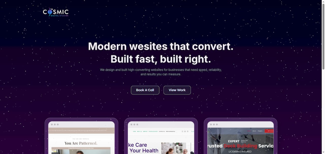
If your current homepage isn’t generating consistent leads, the fix is usually structural, not cosmetic. Cosmicdigitalstudios offers a homepage audit that identifies exactly where visitors drop off and what to change first. Whether you need a full custom website build or a focused redesign, the process is straightforward: strategy call, custom design, conversion-optimized build, and launch. Ready to see what your homepage should look like? Request your homepage audit and get a clear plan within days.
Research sources and further reading
The recommendations in this article draw from the following sources. Each one supports a specific section of the guidance above.
| Source | Description | Most relevant section |
|---|---|---|
| Podium — Plumbing Website Design Examples | Mobile-first design, tap-to-call placement, and live chat conversion data for plumbing sites | Conversion and mobile best practices |
| Simpro — Plumbing Website Design Tips | CTA hierarchy, hero clarity, and above-the-fold trust signal recommendations | Homepage patterns, CTA structure |
| Colorlib — Best Plumbing Website Designs | Navigation, contact placement, typography, and color scheme guidance | Visual design, layout structure |
| SiteBuilderReport — Plumbing Website Examples | Service page links, review snippets, gallery optimization, and local landing pages | Gallery best practices, adaptation guide |
| FieldEdge — Best Plumbing Websites | Emergency badges, urgency cues, and scheduling CTA patterns | Conversion best practices, homepage patterns |
| HubSpot — 24 Plumbing Website Design Examples | Curated real-world examples with design notes across 24 plumbing businesses | All sections — reference examples |
Recommended
- Types of Home Service Website Layouts That Drive Leads – cosmicdigitalstudios.com
- Examples of Landscaping Company Websites That Convert – cosmicdigitalstudios.com
- Local Business Homepage Section Checklist That Converts – cosmicdigitalstudios.com
- Turn Website Visitors into Clients in 2026 – cosmicdigitalstudios.com