
Most people assume website UX is about making a site look good. It is not. Website UX, or website user experience, is about how every visitor feels when they interact with your site, from the moment they land to the moment they leave. That feeling determines whether they book a call, buy a product, or click away in frustration. Get it right and your site becomes your best salesperson. Get it wrong and even a beautiful design will quietly drain revenue. This guide breaks down what website UX really means, why it matters, and exactly how to improve it.
Table of Contents
- Key Takeaways
- What website UX actually means
- The business impact of good UX
- Website UX design principles that actually work
- Common UX mistakes that hurt your site
- How to start improving your website UX
- My honest take on why UX keeps getting underestimated
- Build a site that actually converts
- FAQ
Key Takeaways
| Point | Details |
|---|---|
| UX is not visual design | Website UX covers the full user journey, not just colors, fonts, or layout aesthetics. |
| Speed directly drives revenue | A 1-second delay in page load reduces conversions by 20% and spikes bounce rates significantly. |
| ROI on UX is measurable | Every $1 invested in UX returns roughly $100 on average through conversions and retention. |
| Design for scanners, not readers | Users read only 20-28% of page text, so layout and hierarchy matter more than copy volume. |
| UX is an ongoing process | Treating UX as a one-time project leads to stagnation. Iteration based on real data is the standard. |
What website UX actually means
Website user experience, or website UX, is the sum of every thought, feeling, and reaction a visitor has while using your site. It covers what they see, how fast the page loads, how easy it is to find what they need, and whether the whole thing just feels right.
UX is a holistic philosophy covering user feelings, interactions, and perceptions across the entire journey, not just individual tasks or visual choices. Design researcher Don Norman, who coined the term “user experience,” describes it across three levels: interaction (how you complete a task), journey (how the experience flows over time), and relationship (how you feel about the brand afterward). That last level is where real loyalty is built or lost.
Here is where most people get confused:
- UX vs. UI: User interface (UI) is the visual layer. Buttons, colors, typography, images. UX is the logic and feeling behind all of it. You can have a stunning UI sitting on top of a broken UX.
- UX vs. usability: Usability is a subset of UX, focused on whether users can complete tasks effectively. Successful UX design is systematic and repeatable, bridging business goals with user behavior. Usability is one component of that system.
- UX as a process: What does website UX mean in practice? It means research, testing, iteration, and measurement. Not a single design decision made in isolation.
Pro Tip: If your site looks polished but visitors are not converting, suspect UX before you suspect your offer. A beautiful UI with poor UX leads to failure almost every time.
The business impact of good UX
This is where the conversation shifts from “nice to have” to “non-negotiable.”
The numbers are clear. Sites meeting Core Web Vitals thresholds see 23.7% more organic traffic and 34% higher conversion rates on average. A single second off your Largest Contentful Paint (LCP) score correlates to a 7.3% lift in conversions. These are not theoretical gains. They show up in your analytics.
“Every $1 invested in UX returns $100 on average, with optimized UX potentially improving conversion rates by up to 400%.”
Core Web Vitals are Google’s set of performance metrics that measure real-world user experience on your site. They track three things: how fast your main content loads (LCP), how quickly your page responds to input (INP), and how much your layout shifts during load (CLS). Google evaluates these metrics using real user data at the 75th percentile, meaning a portion of slow experiences can still drag down your rankings even if most users are fine.
The cost of ignoring UX is concrete. A 1-second delay reduces conversions by 20% and increases bounce rates by over 30%. For a business generating $50,000 per month through its website, a chronic speed problem could mean $10,000 or more in lost revenue every single month.
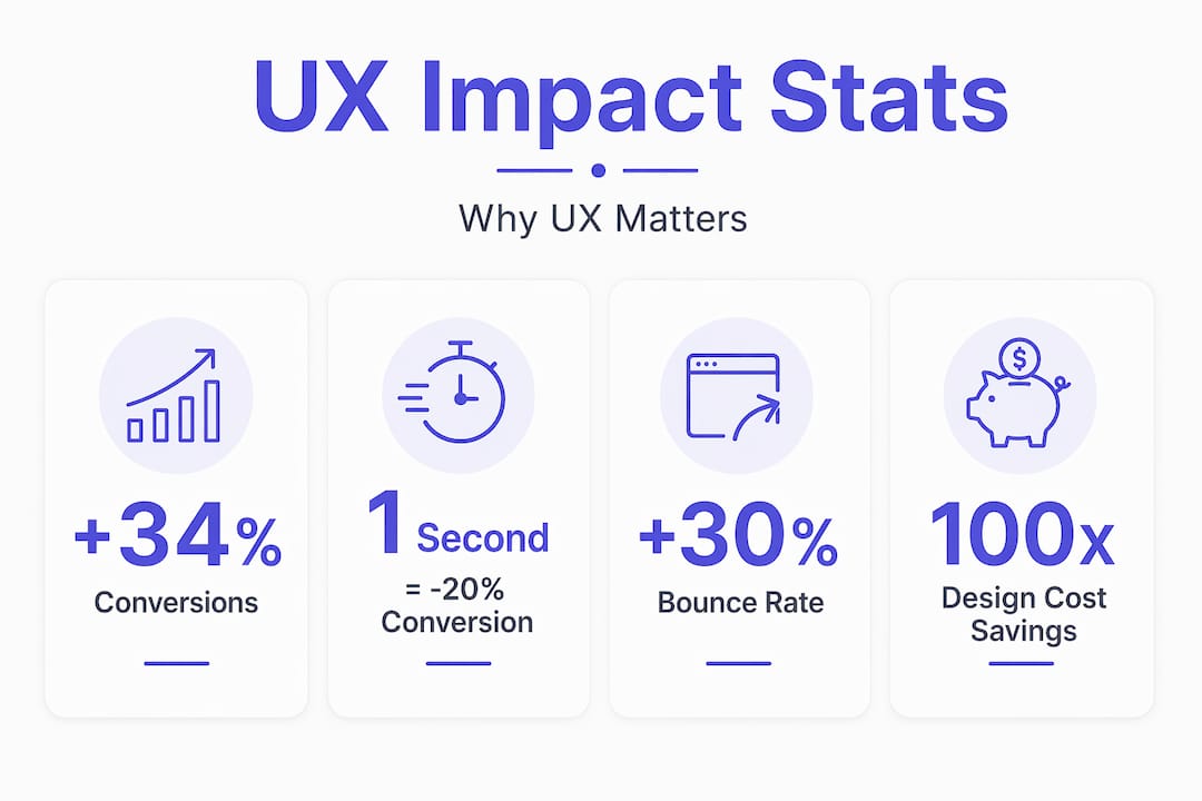
There is also the engineering angle. The 1:100 rule states that fixing UX errors at the design stage costs 100 times less than fixing them after launch. Skipping UX investment early does not save money. It multiplies the cost of fixing problems later.
Pro Tip: Performance gains hit hardest on mobile and for new visitors on slower networks. If your audience skews mobile, UX speed improvements should sit at the top of your priority list.
Website UX design principles that actually work
Knowing the theory is one thing. Applying website UX design principles to a real site is where most business owners need a practical framework.
Simplicity and cognitive load
Every element on a page asks the brain to process something. Too many elements mean too much work, and visitors leave. White space increases content comprehension by up to 20% by guiding attention to what matters. A product page that strips away three unnecessary sections and adds breathing room will outperform a cluttered one almost every time.

Design for scanning, not reading
Users typically scan only 20-28% of web page text, following F-pattern or spotted scanning behavior. That means your most important message needs to be in the first line, the first subheading, and the first bullet. Everything else supports the scan.
Consistency across the site
Navigation, button styles, heading hierarchy, and messaging should behave the same way on every page. When users can predict where things are, they trust the site more. Inconsistency creates friction. Friction kills conversions.
Responsive design and speed
A site that works on desktop but breaks on mobile is not a website anymore. It is half a website. Mobile optimization is now a core UX requirement, not an add-on. You can read more about mobile speed and conversions and why it matters specifically for small businesses.
Accessibility and inclusive design
Accessible design means your site works for users with visual impairments, motor limitations, or slower devices. Beyond being the right thing to do, accessible sites rank better, serve more users, and reduce legal risk. Basics include sufficient color contrast, alt text on images, and keyboard-navigable menus.
Pro Tip: Color choices directly shape user behavior and emotional response. Treating color as purely aesthetic misses a major UX lever.
Common UX mistakes that hurt your site
Most UX problems are not exotic. They are the same five mistakes showing up on business websites across every industry.
-
Treating UX and UI as the same thing. A visually impressive site can still have a confusing structure, unclear calls to action, and a checkout process that frustrates users. Good looks do not fix bad flows.
-
Building for desktop and ignoring mobile users. More than half of web traffic is mobile. If your UX decisions were made on a large monitor, they may be completely wrong for the user on a phone waiting for a page to load on a 4G connection.
-
Overloading pages with content. More information does not equal more value. When users face walls of text, competing banners, or five simultaneous calls to action, they choose none of them. Removing content is often a UX improvement.
-
Ignoring page speed consequences. Slow load times are not a technical inconvenience. They are a UX failure. Focusing on fixing the slowest user experiences yields disproportionate revenue and ranking benefits. Start with the long tail of poor performance.
-
Treating UX as a one-time project. Launching a redesigned site is not the finish line. User behavior changes. Your offerings change. Traffic sources change. UX needs ongoing measurement and adjustment to stay effective.
How to start improving your website UX
You do not need a massive budget or a full redesign to make real progress. You need a clear sequence.
-
Gather real user feedback. Tools like Hotjar or Microsoft Clarity show you session recordings and heatmaps. Watch where users click, where they stop scrolling, and where they leave. Five session recordings will teach you more than a week of theorizing.
-
Measure your Core Web Vitals. Google’s PageSpeed Insights is free and takes two minutes. Run your homepage, your landing pages, and your most-visited pages. Look for failing scores on LCP, INP, and CLS. Moving from ‘Poor’ to ‘Good’ on Core Web Vitals delivers clear ranking and engagement improvements. Going from ‘Good’ to ‘Excellent’ often has negligible effect, so prioritize accordingly.
-
Prioritize fixes by impact. Not every UX problem is equally costly. Fix the issues that affect the most visitors and sit on the highest-traffic pages first. A slow homepage costs you more than a slow FAQ page.
-
Test changes with real users. Push a variation live, watch what happens, and measure. Usability testing does not need to be formal. Ask five people to complete a task on your site and observe where they get confused. UX design teams combining research and iterative testing produce far better outcomes than those designing by intuition alone.
-
Know when to bring in a professional. If your site needs structural changes or a performance overhaul, a website redesign may be the more efficient path. Patching UX problems on a fundamentally broken structure is expensive and slow.
Pro Tip: Good UX dramatically cuts support costs because intuitive design reduces user confusion. If your inbox is full of “how do I…” questions, that is a UX signal worth acting on.
My honest take on why UX keeps getting underestimated
I have worked with enough business owners to recognize the pattern. UX gets treated as a design expense until a site fails to convert, a competitor quietly takes market share, or a Google core update tanks organic traffic. Then it becomes urgent.
Here is what I have come to believe: most businesses do not underinvest in UX because they do not care. They underinvest because no one connected the dots clearly enough between how a site feels and what it earns. Once those dots are connected, the calculus changes immediately.
The myth I keep hearing is that good UX is obvious. That if something is wrong, users will tell you. They will not. They will just leave. The UX role in organic growth is deep and strategic, not visible in a single session. You see it in compounding traffic, lower acquisition costs, and customers who refer others because the experience felt effortless.
My take is this: UX is not a department or a deliverable. It is a standard of care for the people visiting your site. Build with that mindset from day one, and you will rarely need an emergency redesign later.
— Max
Build a site that actually converts
If this article clarified what website user experience means and what it costs to ignore it, the natural next question is: where does your site stand right now?
At Cosmicdigitalstudios, we build fast, modern websites that are designed around real user behavior and conversion goals. Every build accounts for Core Web Vitals performance, mobile-first design, and clear visitor flow from entry point to action. Whether you need a full custom website built from scratch or want to understand what a structured improvement process looks like, we are ready to help. You put in the work to get visitors to your site. The site should be doing its part to keep them there.
FAQ
What does website UX mean?
Website UX, or website user experience, refers to how a visitor feels and interacts across their entire journey on your site, including speed, navigation, design clarity, and ease of completing a goal.
How is UX different from UI?
UI (user interface) is the visual layer of a website, such as colors, fonts, and buttons. UX is the broader system governing how interactions feel, flow, and serve user needs. A site can have great UI and poor UX at the same time.
Why does website UX matter for conversions?
Sites that meet Core Web Vitals thresholds see up to 34% higher conversion rates on average, and a single second off load time can cut conversions by 20%. UX directly shapes whether visitors take action or leave.
How often should I improve my website UX?
UX improvement should be continuous. Monitor Core Web Vitals regularly, review user session data monthly, and run usability tests when you make major changes to content, structure, or offers.
What is the first step to improving website UX?
Start with a free Core Web Vitals audit using Google’s PageSpeed Insights and install a heatmap tool to watch real user behavior. These two steps will surface your highest-impact problems within days.