Conversion rate optimization (CRO) is the practice of turning website visitors into clients by guiding them through a deliberate path from passive browsing to a specific action. Most small business owners focus on driving more traffic, but the real opportunity sits in the traffic you already have. A site that converts 3% of visitors instead of 1% triples your revenue without spending another dollar on ads. This guide covers the exact strategies, from personalized CTAs to exit-intent pop-ups, that move real people from your homepage to your contact form.
Why turning website visitors into clients starts with a post-click plan
Traffic without direction is wasted. Moving visitors from passive browsing to meaningful action requires one thing above all else: a clear, single next step waiting for them after they land on your page. That next step is your post-click plan, and without one, even well-targeted visitors leave without converting.
Your post-click plan defines what you want the visitor to do next. Options include booking a discovery call, filling out a quote request form, downloading a lead magnet, or signing up for a free trial. The mistake most small business owners make is offering all of these at once. When visitors face too many choices, they make none.
Tools like Leadfeeder and HubSpot let you track which pages visitors view, how long they stay, and where they drop off. That behavioral data tells you which post-click plans are working and which ones need fixing. A visitor who reads your pricing page three times is signaling high intent. Your post-click plan for that page should be a direct booking link, not a generic newsletter signup.
- Define one primary conversion goal per page. A homepage, a service page, and a blog post each need a different next step.
- Match the ask to the visitor’s stage. Cold traffic needs low-commitment offers. Warm traffic can handle a direct sales conversation.
- Track drop-off points. Use tools like Google Analytics 4 or Hotjar to see where visitors exit before converting.
Pro Tip: Use Leadfeeder’s company identification feature to see which businesses are visiting your site, then tailor your follow-up outreach to match the pages they viewed.
How personalized CTAs outperform generic ones by 202%
A personalized call-to-action (CTA) is one that changes based on who is viewing it, where they came from, or what they have already done on your site. Personalized CTAs perform 202% better than basic CTAs, according to HubSpot’s analysis of over 330,000 CTAs. That is not a marginal improvement. It means a button that speaks directly to a visitor’s situation converts at three times the rate of a generic “Contact Us.”
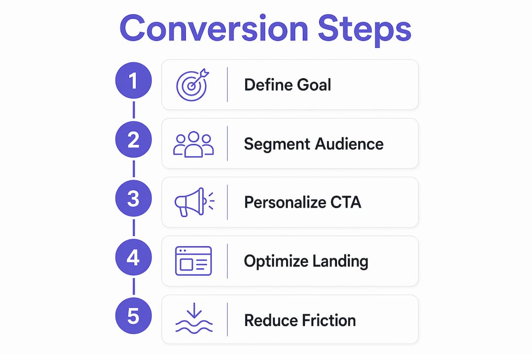
Personalization does not require a complex tech stack. Start by segmenting visitors into three buckets: first-time visitors, returning visitors, and existing leads. A first-time visitor on your homepage should see a low-friction offer like a free audit or a downloadable guide. A returning visitor who has already viewed your pricing page should see “Book Your Free Call Today.” The copy changes, the conversion rate follows.
Placement matters as much as copy. CTAs placed above the fold, within the body of long-form content, and at the end of service pages each serve a different reader. Visitors who scroll to the bottom of a page have self-selected as interested. Give them a stronger, more direct ask. You can also use strong CTA copy to reinforce urgency without resorting to pressure tactics.
Common CTA mistakes to avoid:
- Multiple competing CTAs on one page. Pick one primary action and one secondary action at most.
- Vague button copy. “Submit” tells visitors nothing. “Get My Free Quote” tells them exactly what happens next.
- Ignoring mobile layout. A CTA buried below a long paragraph on mobile will not get clicked.
Pro Tip: A/B test your CTA copy before redesigning your entire page. Changing five words on a button has produced double-digit conversion lifts for service businesses.
What makes a landing page convert at 23%?
Landing pages carry the highest average conversion rate at 23% among all signup form types, according to HubSpot’s 2026 CRO guidance. That number assumes the page is built correctly. Most landing pages underperform because they try to do too much.
A high-converting landing page has one goal, one audience, and one offer. The headline matches the ad or link that brought the visitor there. This is called message match, and breaking it is the fastest way to lose a conversion. If your Google Ad says “Free Website Audit for Local Businesses” and the landing page headline says “Welcome to Our Agency,” the visitor feels disoriented and leaves.

Form placement and length directly affect conversion rates. Optimal lead capture forms use 3 to 5 fields to reduce friction. Asking for a phone number, company size, and annual revenue on a first visit kills conversions. Ask for name, email, and one qualifying question. Collect additional data later through progressive profiling, where each subsequent interaction adds one more field.
Site speed is non-negotiable. Every 1-second improvement in load time can increase conversions by up to 20%. A slow landing page loses visitors before they even read your headline. The impact of site speed on lead generation is direct and measurable.
| Landing page element | Conversion impact |
|---|---|
| Message match (ad to page) | High. Misalignment causes immediate drop-off. |
| Above-the-fold CTA | High. Visitors should not scroll to find the next step. |
| Form field count (3 to 5) | High. Fewer fields reduce friction and increase submissions. |
| Trust signals (reviews, logos) | Medium. Builds credibility and reduces hesitation. |
| Page load speed | High. Each second of delay costs conversions. |
Pro Tip: Add one specific client result near your CTA. “Helped 47 local contractors book more jobs” outperforms any generic trust badge.
How to reduce friction in lead capture forms
Form design is where most websites quietly lose clients. The research is clear: fewer form fields improve conversion rates, but the goal is not just volume. It is qualified volume. A form that collects 200 low-quality leads is worse than one that collects 50 leads who are ready to buy.
Progressive profiling solves this tension. On the first visit, you ask for a name and email. On the second visit, when the visitor returns to download another resource, you ask for their business type. By the third interaction, you have enough data to personalize your follow-up without ever overwhelming them with a long form upfront. HubSpot’s Smart Forms feature automates this process natively.
Interactive tools take form optimization further. Quizzes and calculators convert up to 35% of visitors in some contexts, compared to 2 to 3% for static forms. A roofing company that replaces its contact form with a “How Much Will My Roof Replacement Cost?” calculator gives visitors immediate value. In exchange, the visitor provides their address, roof size, and contact details. The lead is warmer and more qualified than any generic form submission.
Key form optimization principles:
- Use inline validation. Show visitors immediately if they have entered an invalid email, rather than after they click submit.
- Label fields clearly. Placeholder text that disappears when a visitor clicks is a usability problem, not a design feature.
- Make the submit button specific. “Calculate My Cost” beats “Submit” every time.
Pro Tip: If your form has more than five fields and your conversion rate is below 2%, cut two fields immediately and measure the result over 30 days.
Using exit-intent pop-ups and live chat to recapture lost leads
Exit-intent pop-ups trigger when a visitor’s cursor moves toward the browser’s close button or address bar. Deployed correctly, they increase conversions by 5 to 10% by giving you one final opportunity to capture a lead before the visitor leaves. That is a meaningful number when you consider how much effort went into getting that visitor to your site in the first place.
The most effective exit-intent offers are specific and low-commitment. A discount code, a free checklist, a short video training, or an invitation to book a no-pressure call all work well. Generic “Subscribe to our newsletter” pop-ups do not. The offer needs to match what the visitor was already looking at. A visitor leaving your pricing page responds better to “Not ready yet? Book a free 15-minute call” than to a generic email signup.
Live chat is the highest-impact real-time engagement tool available to small businesses. Live chat increases website conversions by 45% by providing instant answers at the exact moment a visitor has a question. The key is personalization. Segment your chat triggers by URL so that visitors on your pricing page see a different opening message than visitors on your about page.
Here is a practical sequence for deploying real-time engagement tools:
- Install exit-intent software like OptinMonster or Wisepops and set triggers for your highest-traffic pages.
- Create page-specific offers that match the content the visitor was reading before they tried to leave.
- Add live chat using Intercom, Tidio, or Crisp, and write custom greeting messages for each key page.
- Segment by visitor history. Return visitors should see different messages than first-time visitors.
- Review chat transcripts weekly to identify the most common questions and add those answers to your FAQ or service pages.
Pro Tip: Set your live chat to trigger after 30 seconds on a page, not immediately. Visitors who have spent 30 seconds reading are far more likely to engage than those who just arrived.
Key takeaways
Converting website visitors into paying clients requires a structured system of clear post-click goals, personalized CTAs, optimized landing pages, frictionless forms, and real-time engagement tools working together.
| Point | Details |
|---|---|
| Post-click plan | Define one clear next step per page to move visitors from browsing to action. |
| Personalized CTAs | Personalized CTAs convert 202% better than generic ones. Match copy to visitor intent. |
| Landing page focus | Keep landing pages to one goal, one offer, and 3 to 5 form fields for peak conversion. |
| Interactive forms | Quizzes and calculators convert up to 35% of visitors versus 2 to 3% for static forms. |
| Real-time engagement | Live chat and exit-intent pop-ups recover leads at the moment of highest intent. |
What I have learned after building conversion-focused sites
I have reviewed hundreds of small business websites, and the pattern is almost always the same. The business owner invested in design, wrote decent copy, and then waited for leads that never came. The problem was not the traffic. It was the absence of a system.
The most common mistake I see is treating conversion as a copywriting problem. You rewrite the headline, change the button color, and wonder why nothing moved. Conversion requires visitor tracking and post-click journey design, not just better words on a page. You need to know what visitors are doing, where they are going, and what stops them from taking the next step.
My honest recommendation for any small business owner: start with one page. Prioritize testing on high-impact pages like your homepage, pricing page, or a dedicated service landing page. Fix the post-click plan on that single page before touching anything else. Get the CTA right. Get the form right. Measure for 30 days. Then move to the next page.
The businesses that convert well are not the ones with the most features or the most traffic. They are the ones that made it obvious what to do next and removed every reason not to do it. That is a design and strategy problem, and it is entirely solvable.
— Max
How Cosmicdigitalstudios builds sites that convert traffic into clients
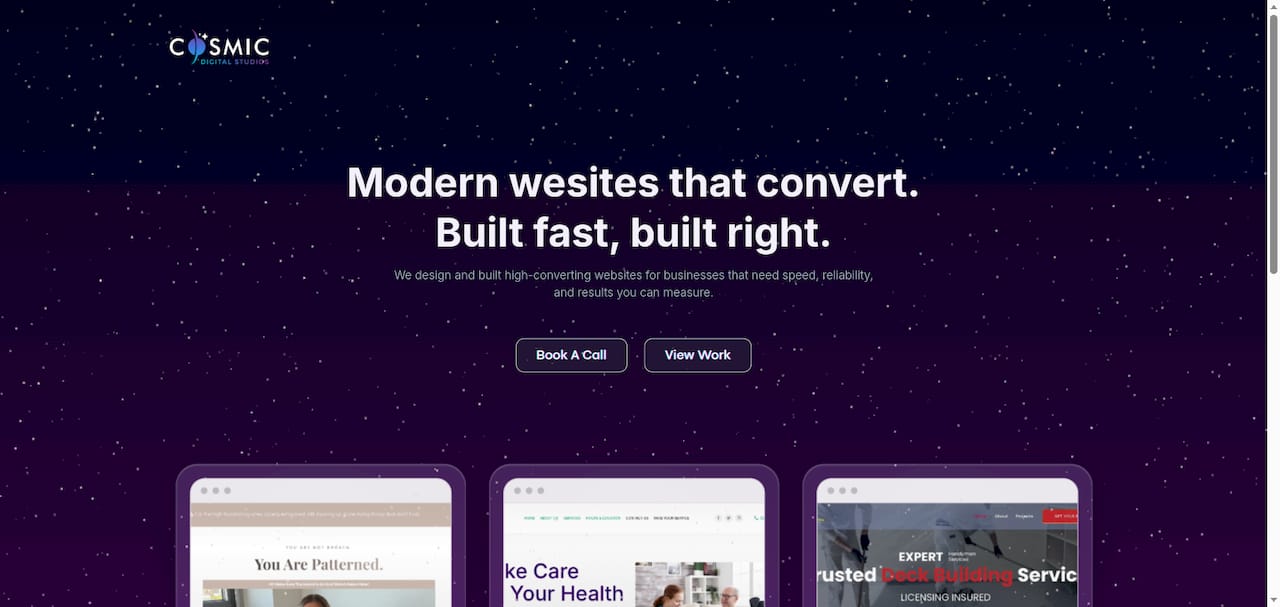
Cosmicdigitalstudios builds conversion-focused websites for small business owners and entrepreneurs who are done guessing why their traffic does not convert. Every site is built with clear post-click goals, fast load times, and page structures designed to guide visitors toward booking a call or submitting a lead form. If your current site looks fine but produces few leads, the issue is almost always structure and messaging, not design. Cosmicdigitalstudios also offers a website redesign guide for business owners ready to fix what is not working. Clean design, strong messaging, and real conversions are the standard, not the exception.
FAQ
What does it mean to turn website visitors into clients?
Turning website visitors into clients means guiding people who land on your site toward a specific action, such as booking a call, filling out a form, or making a purchase. This process is formally called conversion rate optimization (CRO).
How many form fields should a lead capture form have?
Optimal lead generation forms use 3 to 5 fields to reduce friction and increase submission rates. Use progressive profiling to collect additional data across multiple interactions rather than all at once.
Do personalized CTAs really make a difference?
Personalized CTAs perform 202% better than generic ones, according to HubSpot’s analysis of over 330,000 CTAs. Matching your CTA copy and placement to the visitor’s intent or stage in the buying process is the single highest-leverage change most sites can make.
What is an exit-intent pop-up and does it work?
An exit-intent pop-up triggers when a visitor moves their cursor toward the browser’s close button. When deployed with a relevant, low-commitment offer, exit-intent pop-ups increase conversions by 5 to 10%.
How does live chat help convert visitors to customers?
Live chat increases website conversions by 45% by providing instant answers at the moment a visitor has a question. Personalizing chat triggers by page URL and visitor history makes the engagement significantly more effective.